PROJECT
YEAR
CATEGORY
SYNOPSIS
PullThru — Collaborative Scheduling App
2019
UX/UI, Branding
In teams of 4 — develop and refine an application prototype over a series of phases: envisioning the conceptual framework, implementing a working prototype and evaluating and improving the prototype based on user testings.
Final
Deliverables
Collaborated with team members to create an PullThru interactive app prototype made for smartphones with the goal to make event creation between friends and family easier. Decisions regarding the user design and experience (UX/UI) has been supported with written documentation during the development of the app and product showcase video.
Product Showcase Video
Process
Work
App Proposal & Research
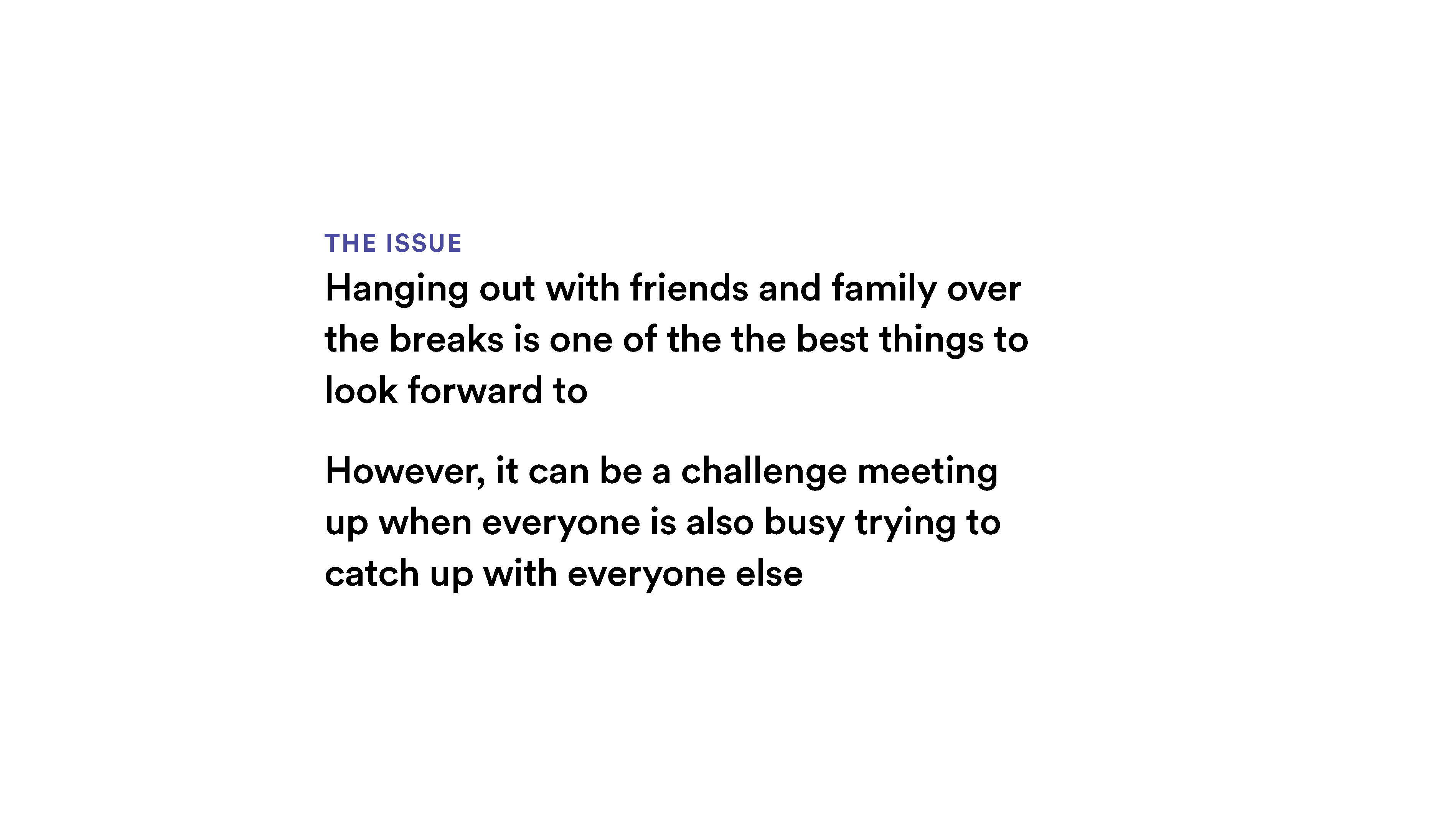
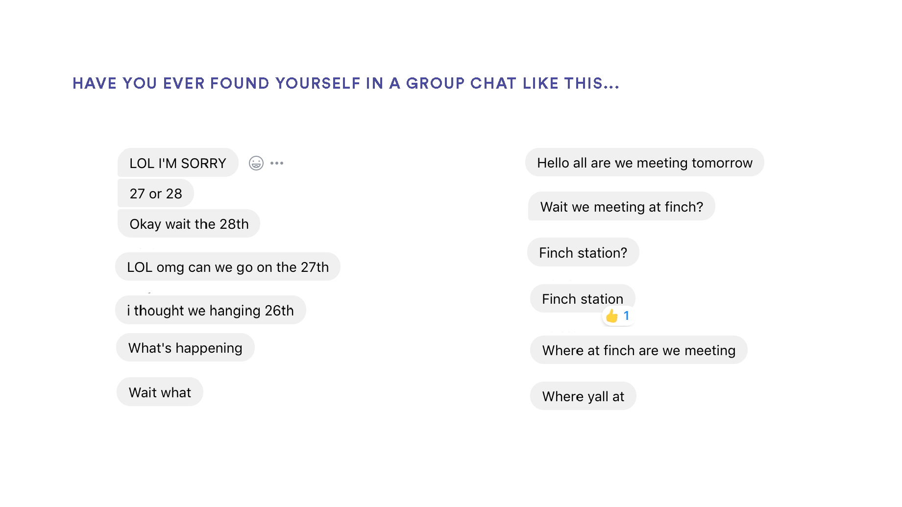
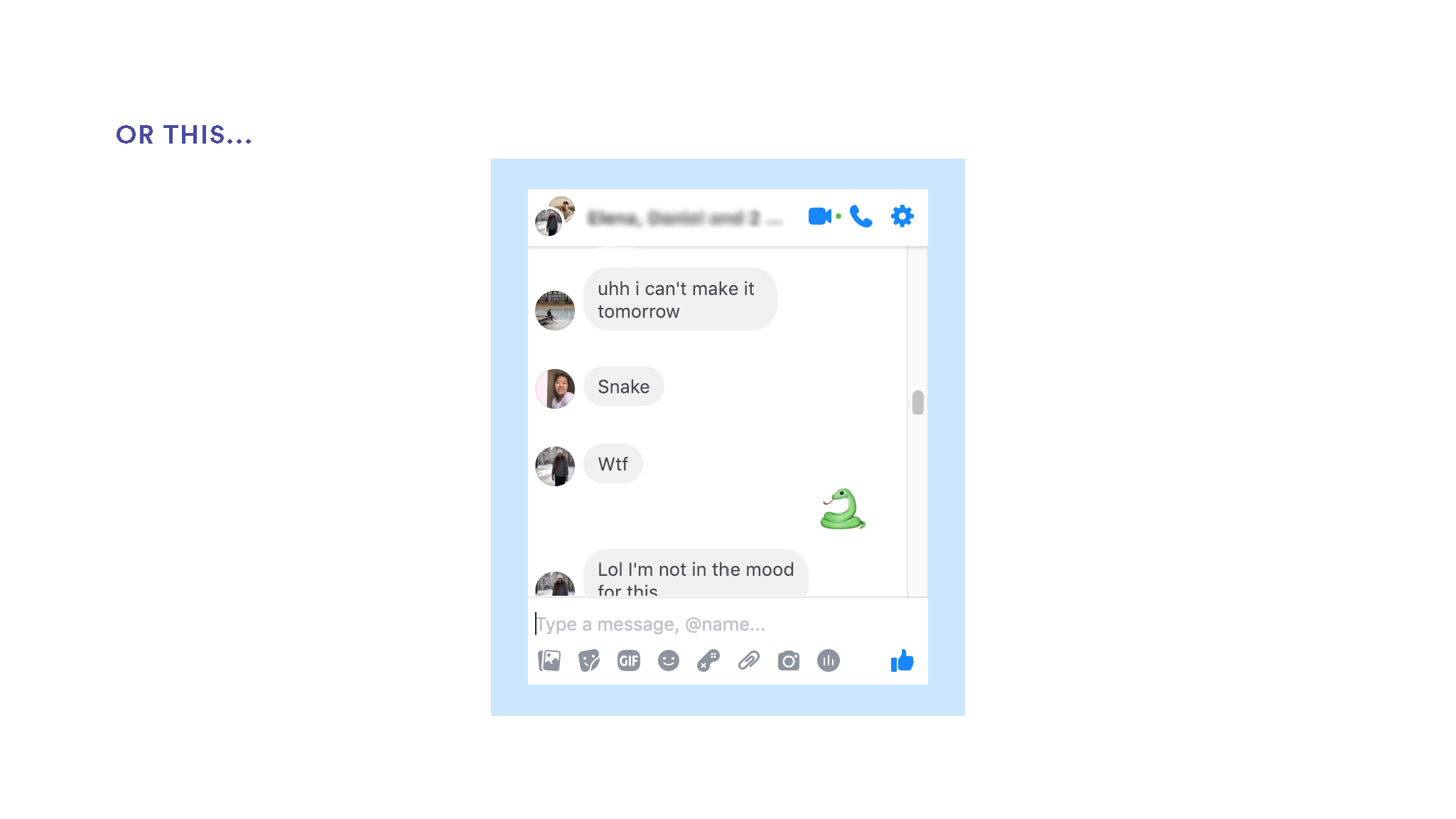
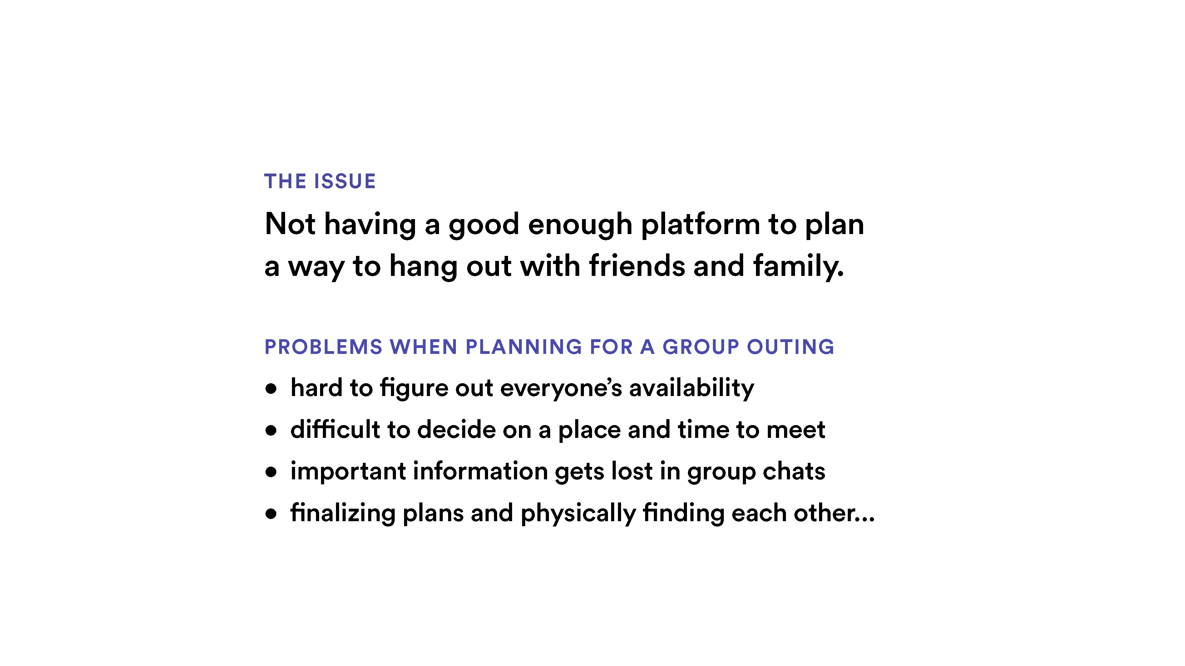
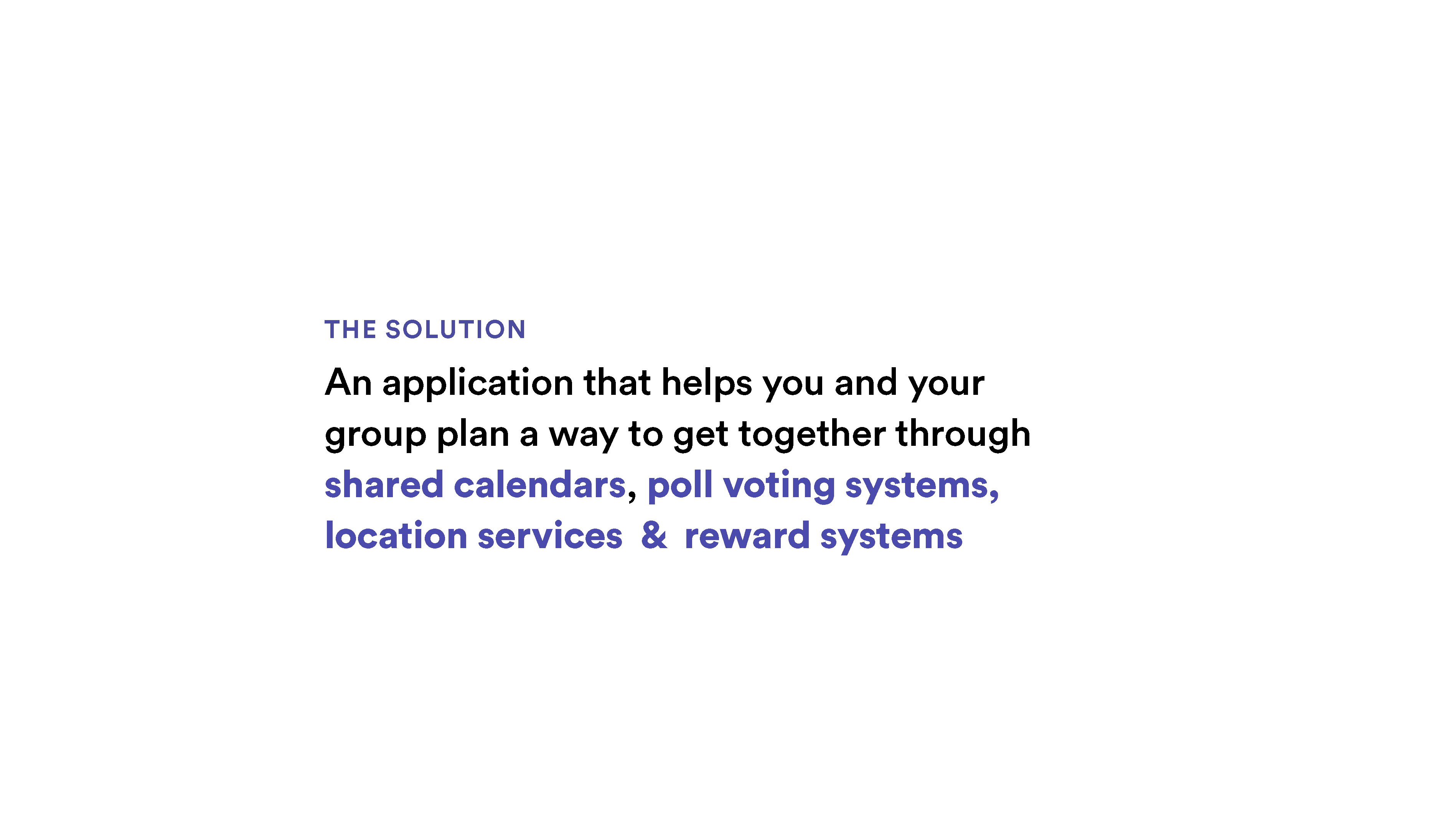
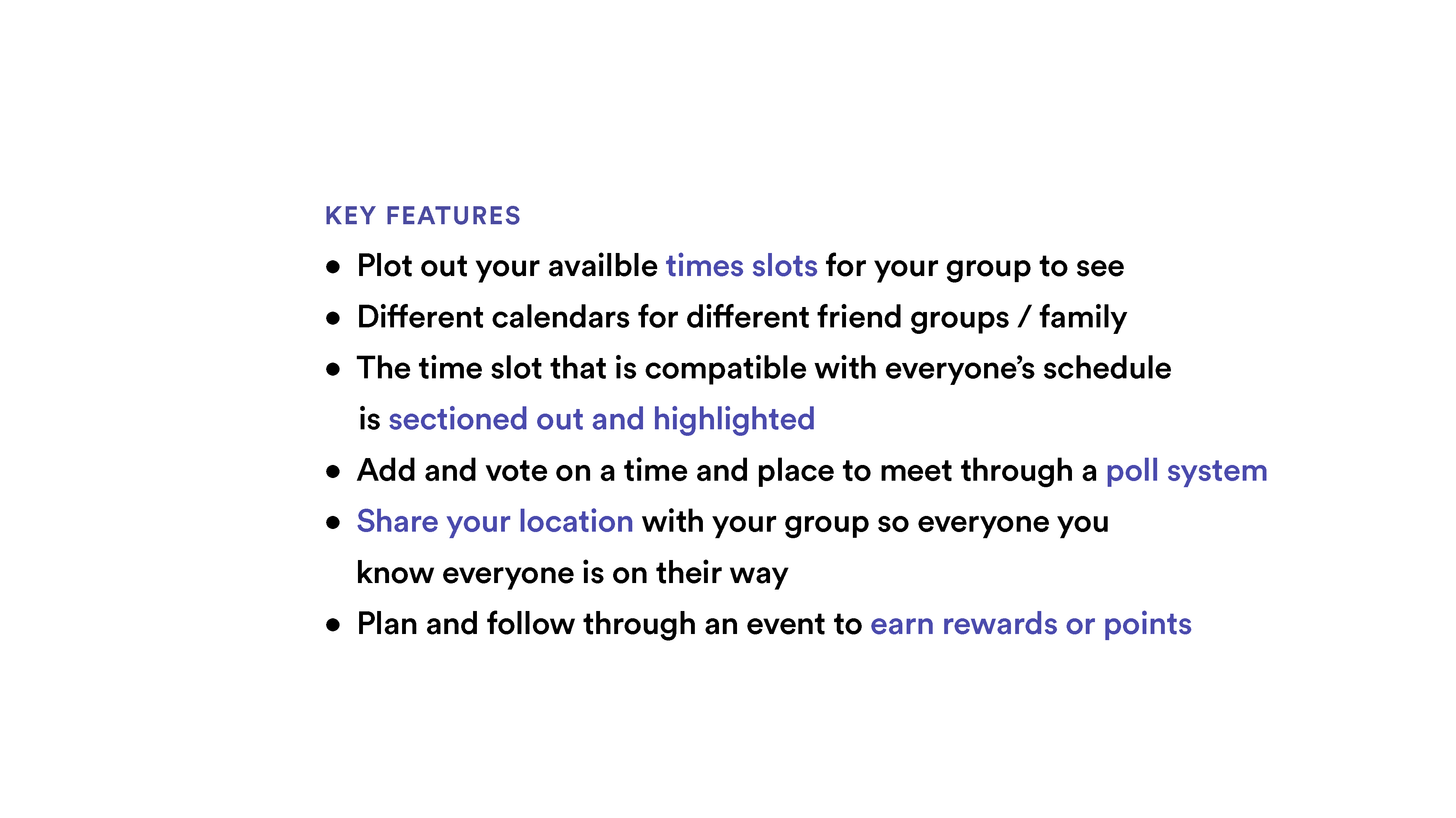
At the beginning of this phase, we've thoroughly investigated multiple topics of including: social enterprise/services, arts, technology, environment, education, health, entertainment, safety/security, and transportation. After agreeing to make collaborative event scheduling our topic, we then employed critical thinking methods to brainstorm and also develop a concept map to explore our chosen subject further.
PHASE ONE
Initial Documentation
P.A.C.T. Analysis
The P.A.C.T Analysis is an essential part of our approach to designing interactive systems and puts people first; We use the acronym PACT (People, Activities, Contexts, Technologies) as a useful framework for thinking about a design situation. As designers, we thoroughly investigated what we need to know about the features of interactive technologies and how to approach designing interactive systems.
System Requirements
A list of ranked app functions. Using the MoSCoW method to prioritize features from must have, to won't have. This was especially helpful after our findings from user interviews, and were updated multiple times.
User Personas & Scenarios
To get a better idea of what was required of our app — each of us created an imaginary user persona with unique characteristics (hobbies, traits, habits and frustrations with event planning) and needs. We then constructed and applied user scenarios, hypothesizing their experiences.
Interview Plan & Responses
A plan written before user testing containing the big questions we want answered. The responses to these questions after doing the interview responses provided actionable insights we've applied to our other documentation — especially for the user personas and scenarios.
User Testing Script & User Objectives and Scenarios
A written script containing the project brief, opening statement, privacy information, "think aloud" prompts for users to speak about their actions and what they find interesting/confusing, and of course the user objectives and scenarios for testers to complete. During and after the user testing we've asked them an additional set of questions regarding their experience with the app - what they liked and challenges they've had with the prototype. This was essential to future development as nearly every feature weas either changed or removed.
User Testing Report
A synthesis of our user test results containing our testing procedure, findings, and reflection. We've also proposed new design requirements and/or features and also areas that require enhancements – both functional (UX) and visual (UI).
Email Invitation & Consent Form
Used the standard York University consent form for user interviews. Also created email invitations send to potential user testers.
PHASE TWO
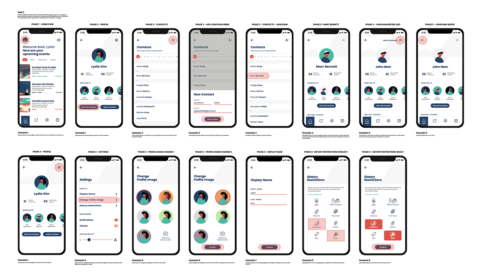
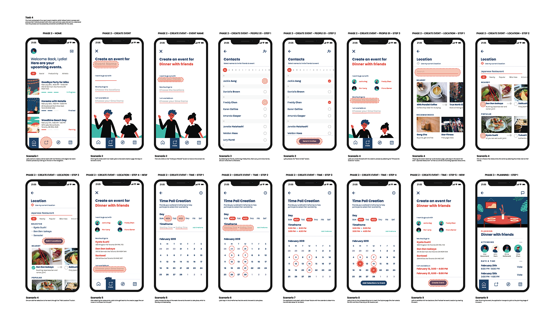
Initial Concepts & Wireframes
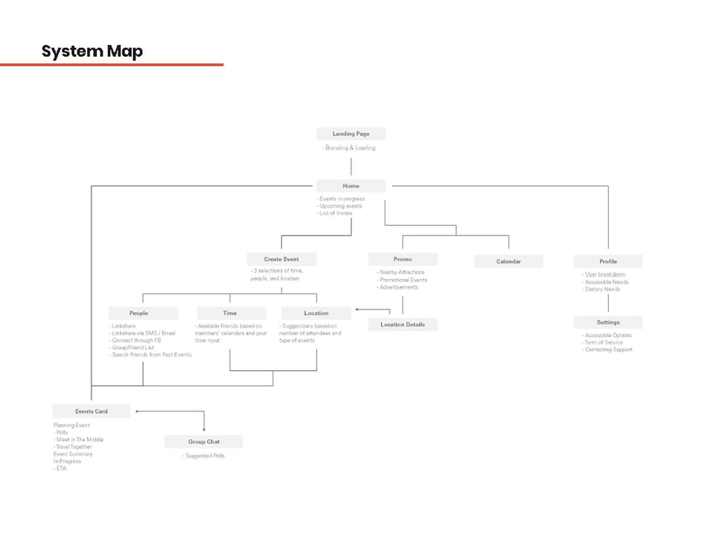
System Map — Slide 1
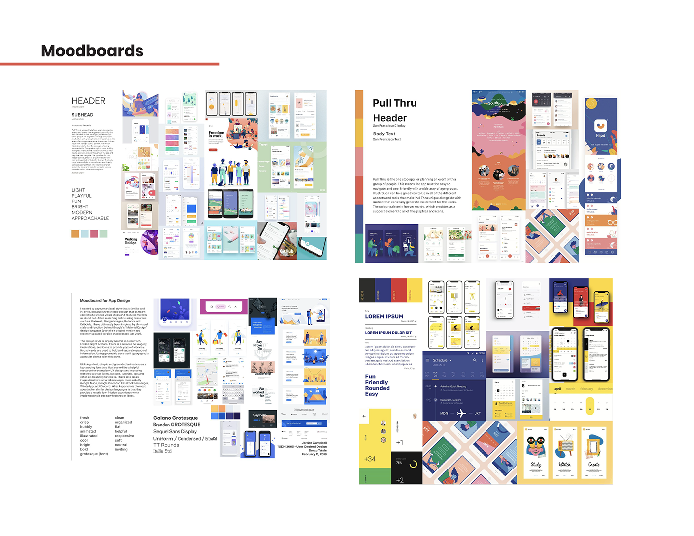
Moodboards — Slide 2
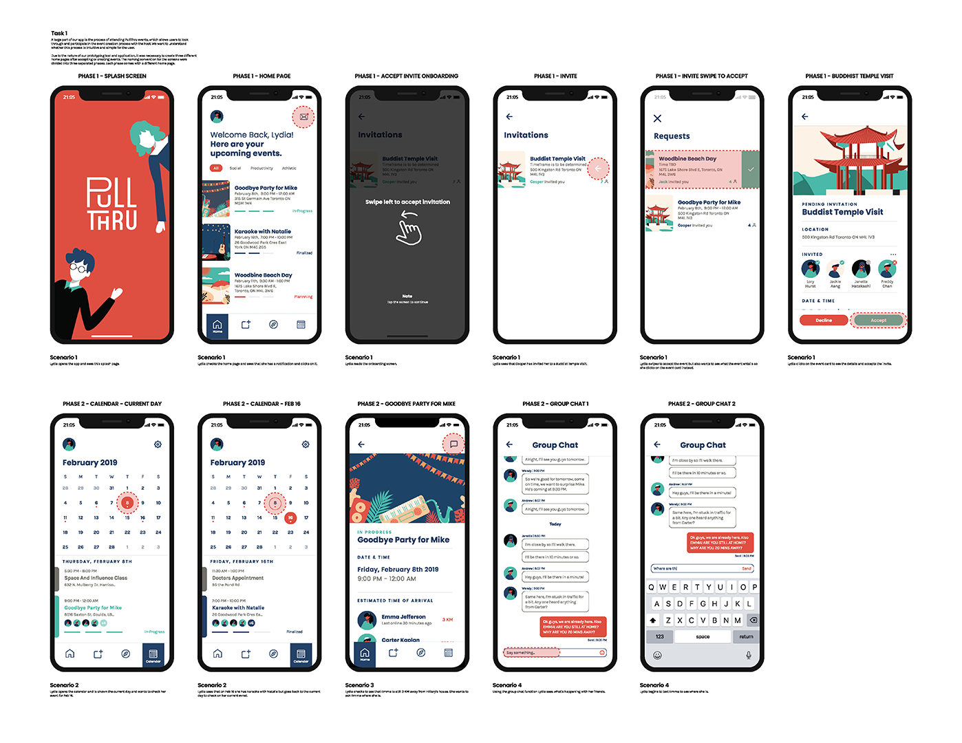
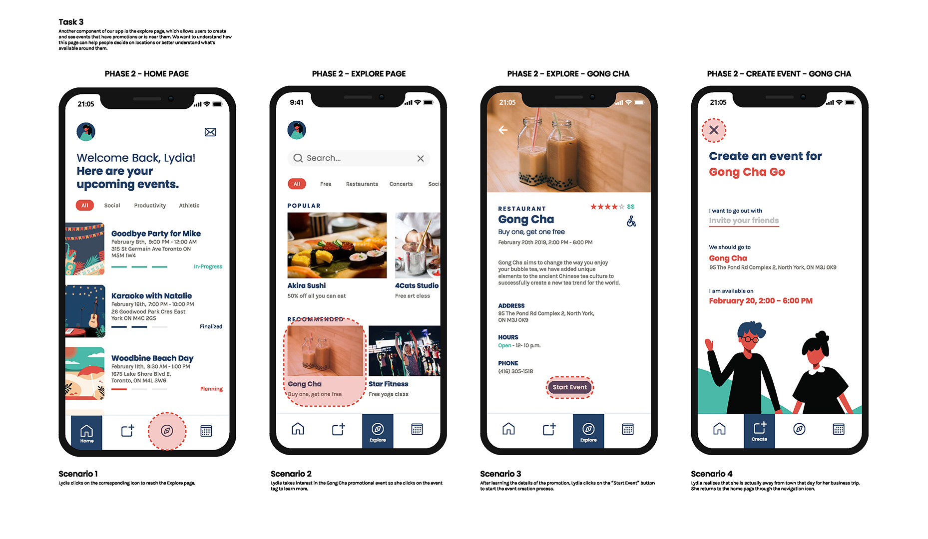
Product Flow — Slides 3-6
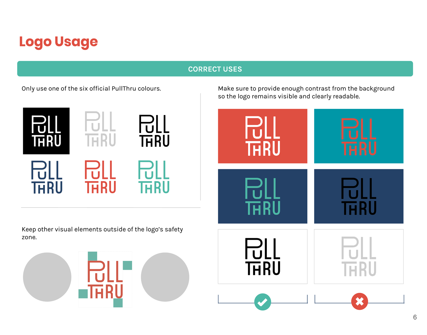
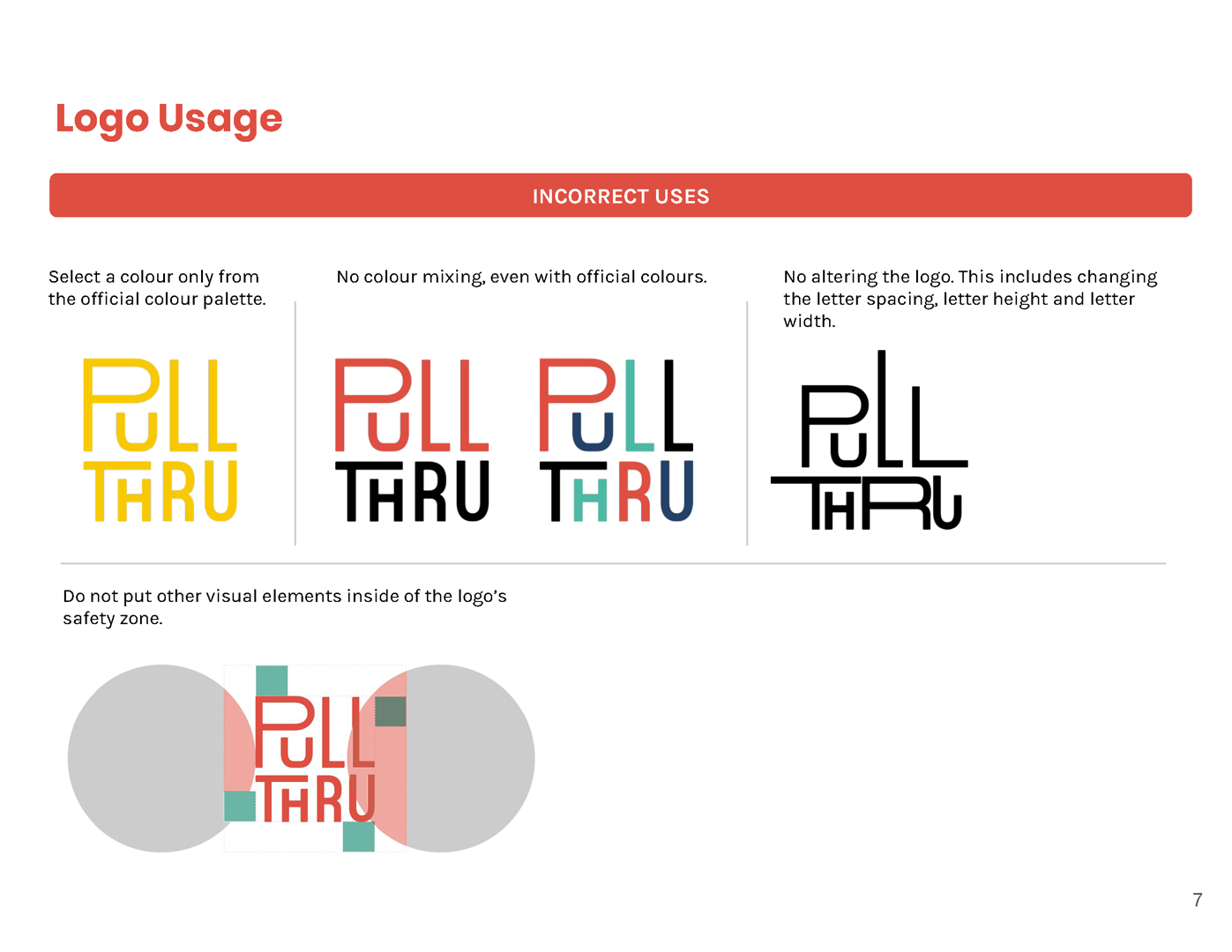
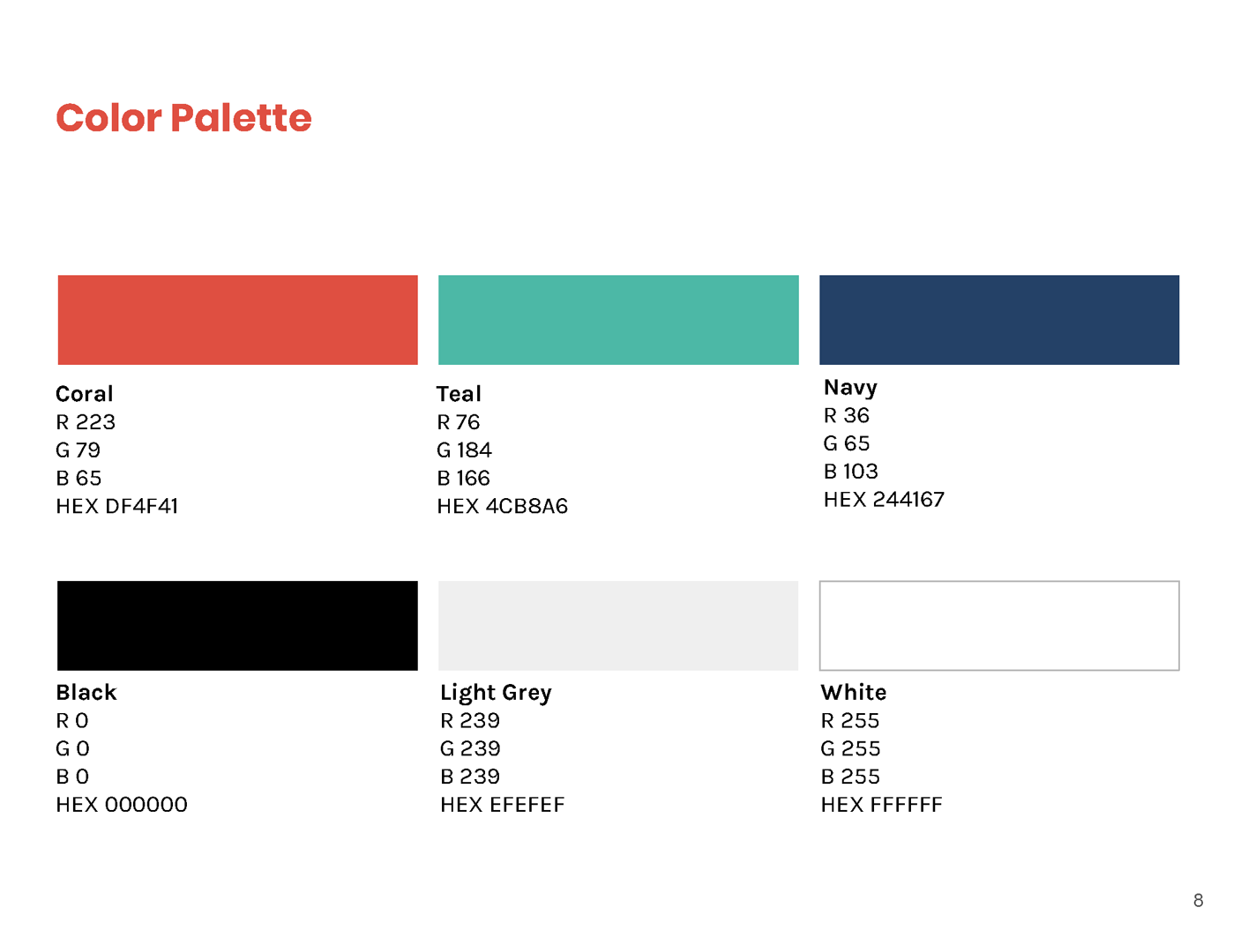
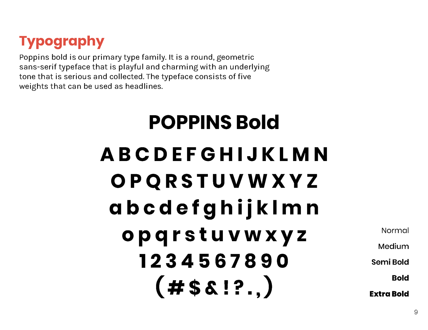
Brand Guideline
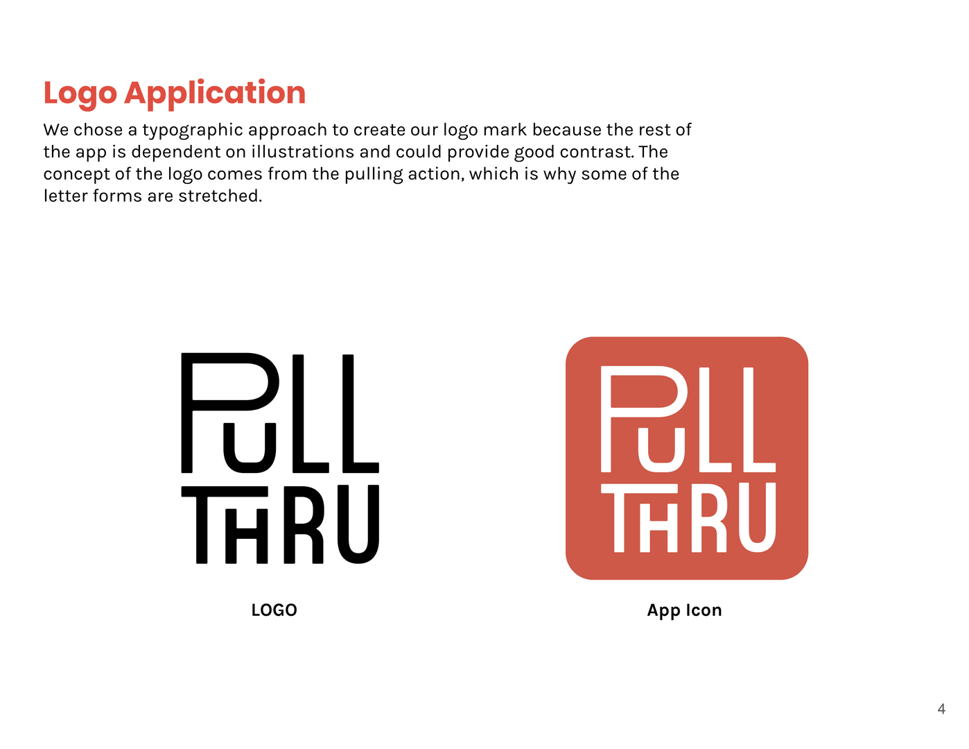
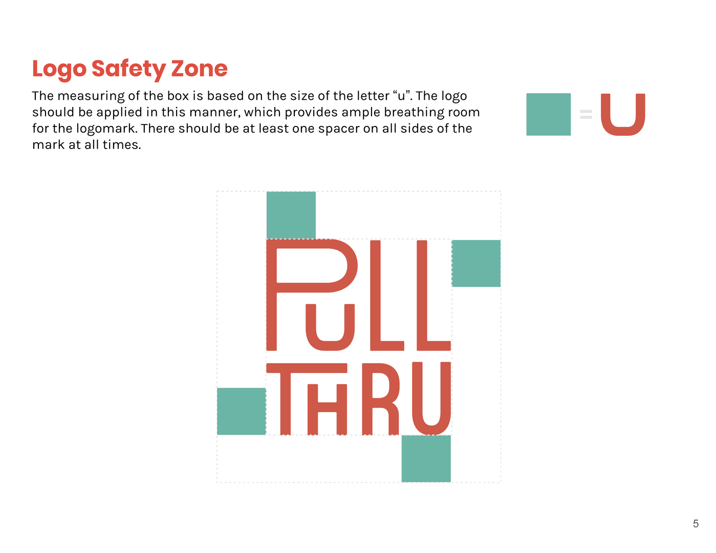
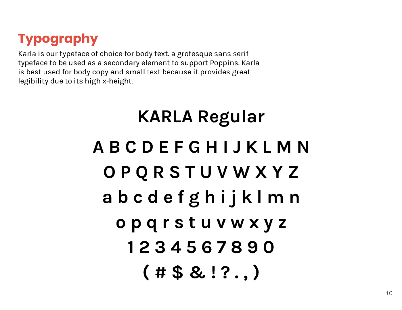
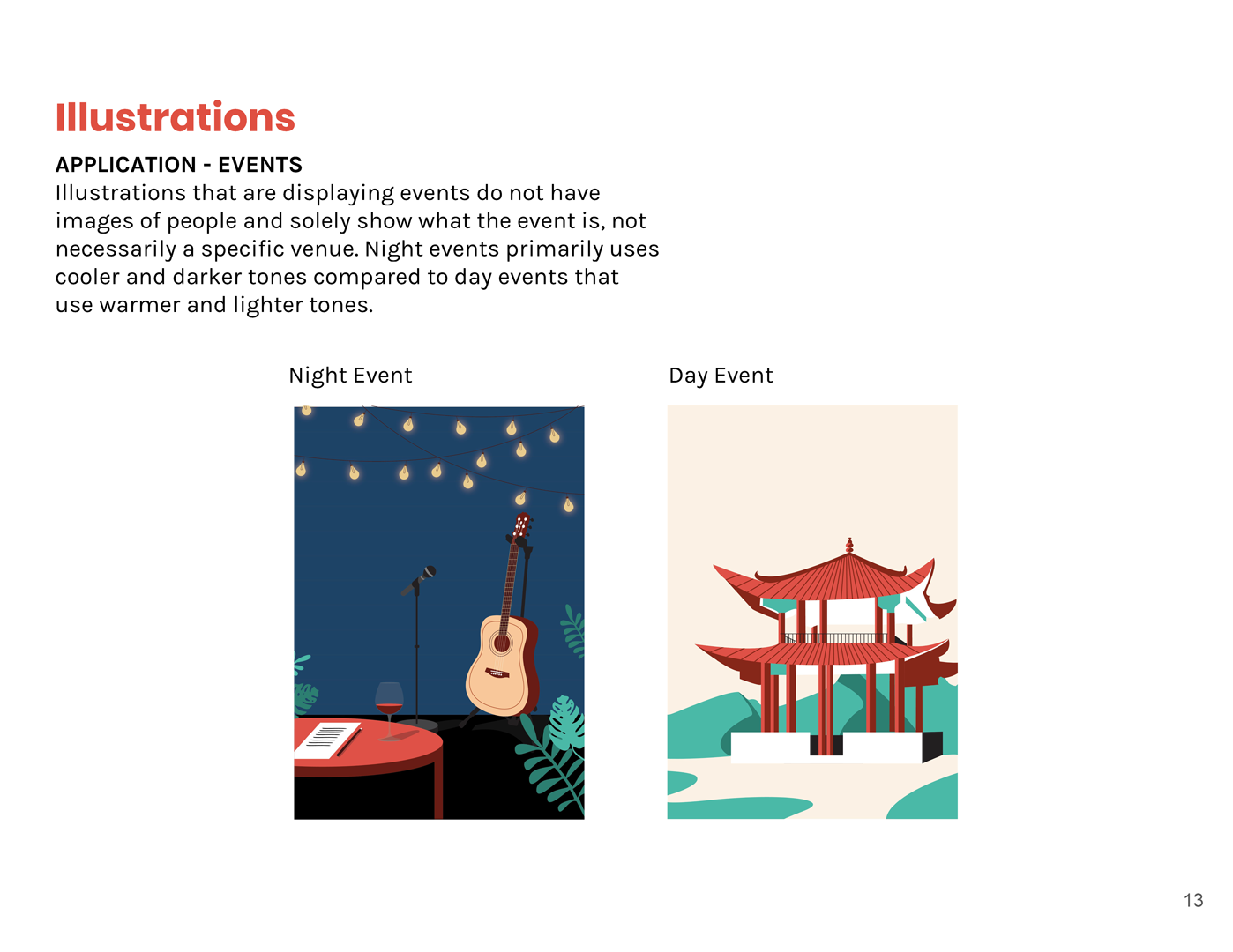
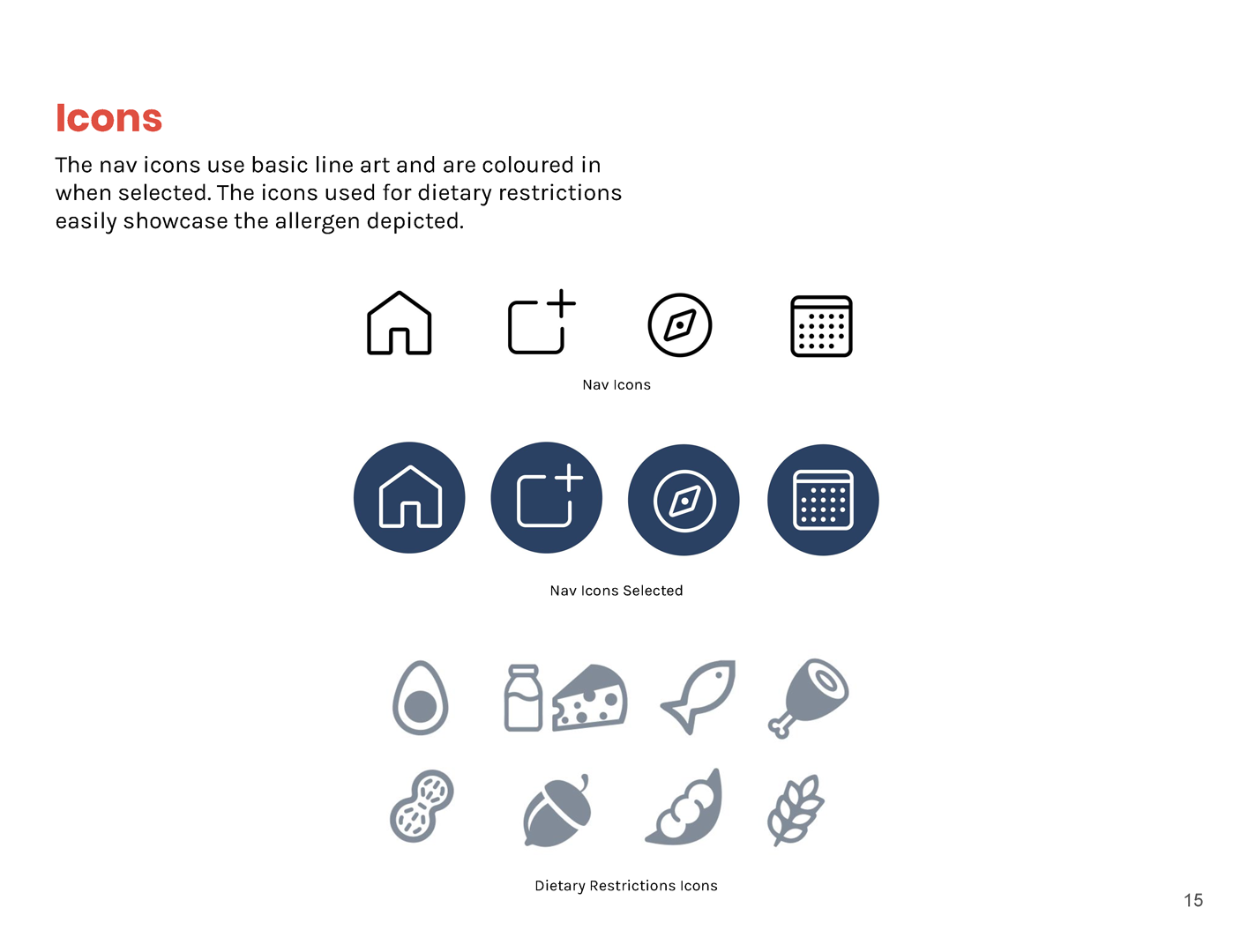
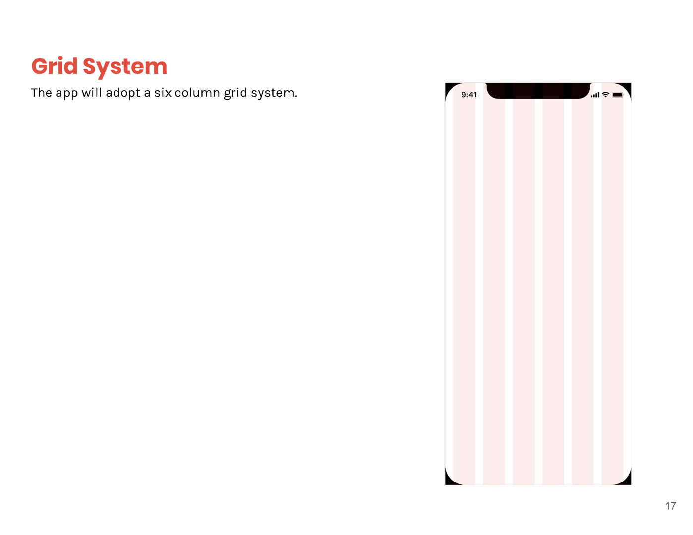
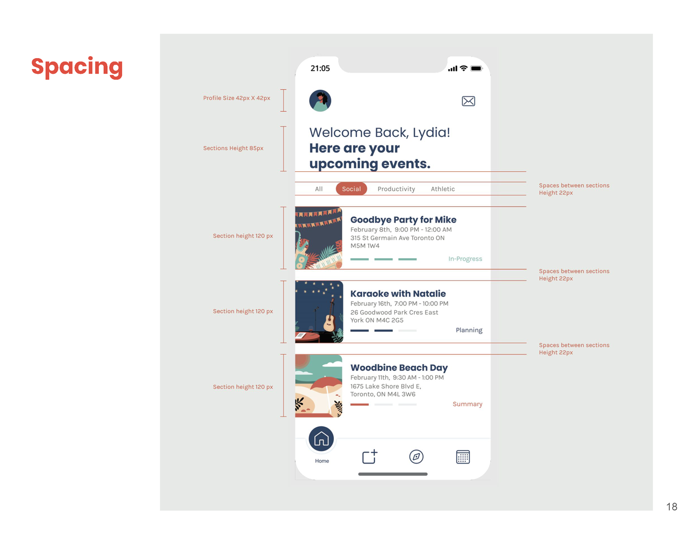
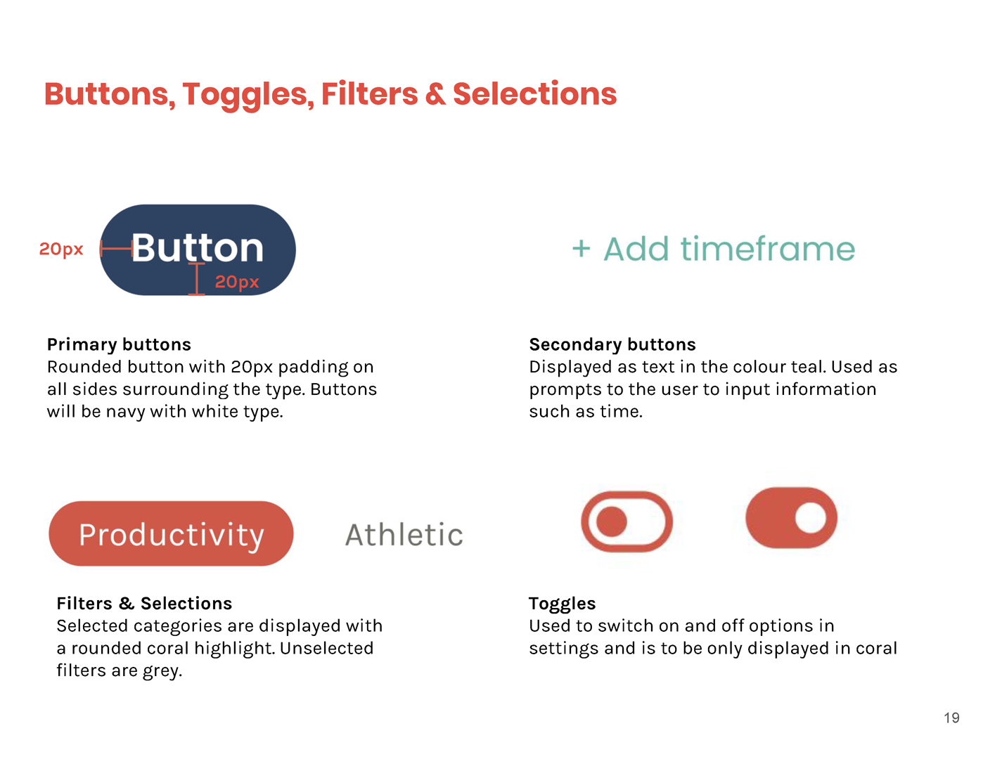
A style guide is developed to aid current/future designers to maintain a product/service/app's visual and functional integrity. View some of the featured pages below.
Check out my other work!
GoodLife RebrandingBranding
DITHER Experimental Digital Arts FestivalBranding & Motion

Division of Students — York UniversityBranding, Communication
They Are Watching: Internet PrivacyInformation Design & UX/UI

York Lions & Athletics and RecreationBranding, Communication

Save The InternetBranding & Communications
Logos: Volume OneBranding

Expense vs. EgoCommunications

2048 AnimatedMotion

Semiotic PostcardsCommunications
© 2024 Jordan Campbell | Always learning. Always growing.
