PROJECT
GoodLife
Rebranding
YEAR
2020
CATEGORY
Branding (Corporate)
SYNOPSIS
Developed a graphic identity system for GoodLife with the preparation of a Graphics Standard handbook.
Overview
The objectives of GoodLife’s re-branding are to strike a better balance between personalized fitness goals, and challenging Canadians to live for what they want. In addition, attention to nutritional health and at-home/at-park exercise. To help realize this vision, greater unity between their static and dynamic means of communications through an expanded, flexible, and focused visual identity would be required.
More creative freedom for designers through an expanded colour set, expressive primary and secondary typefaces, determined column systems for all communication deliverables, greater visual appeal of the brand in general through creative applications of the new brand identifiers, and other unique, creative means to promote the brand.
With the use of complimentary, high contrast colours, and oversized secondary type and main mark — a flexible visual rule set can be made for a dynamic and consistent brand identity that performs with a wide range of intensity and contexts. Collectively, these changes could enable greater methods of motivation for the viewer to join GoodLife and realize their fitness goals.
Essence words
Strength
Physical/Mental, Courage, Stamina, Tenacity
Journey
Adventure, Course, Explore, Progress
Inclusive
Approachable, Broad, Comprehensive
GoodLife Graphics Standard Handbook
The collective documentation which summarizes the identity system and outlines rules for its use to all those who will work with it. This documentation anticipates a wide variety of situations, and restrictions to help keep the integrity of the identity. It also showcases the system's flexibility, giving enough freedom for the organization to expand it and use it creatively.
DELIVERABLE
GoodLife brandmark, main mark, and signature
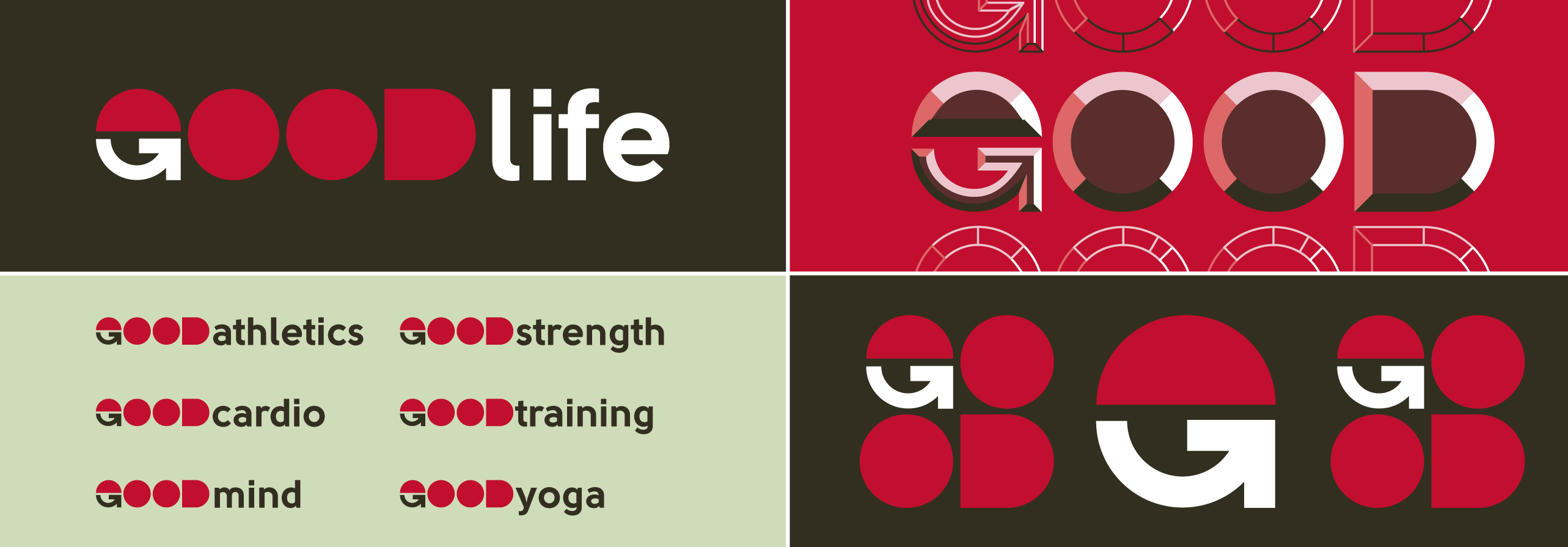
- Top-left image — GoodLife core signature and sub-division signatures for various fitness programs at GoodLife.
- Bottom-left image — GoodLife sub-division signatures for popular activity-focused fitness programs and identifying designated spaces for those programs within GoodLife club locations. Retains the same main mark as core branding.
- Top-right image — To provide more creative flexibility, beveled and outlined variations of the main mark were created. Provides more opportunities for visual flair while maintaining legibility and the brand's unique visual elements for both static and dynamic mediums.
- Bottom-right image — GoodLife brandmark (center), and stacked main mark (left/right).
DELIVERABLE
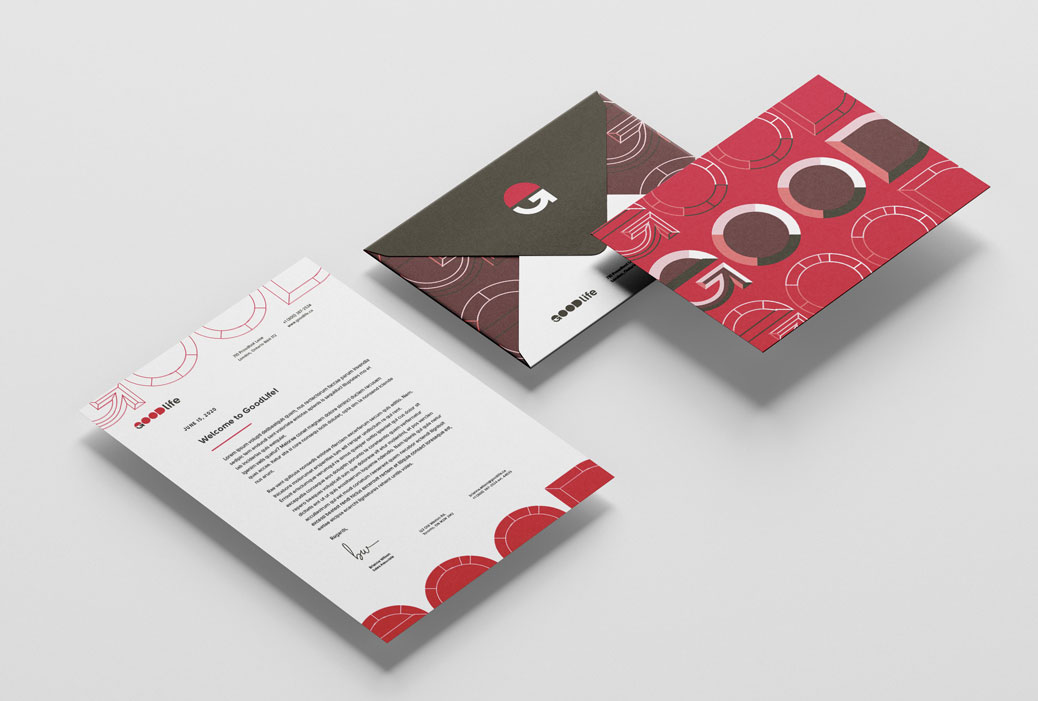
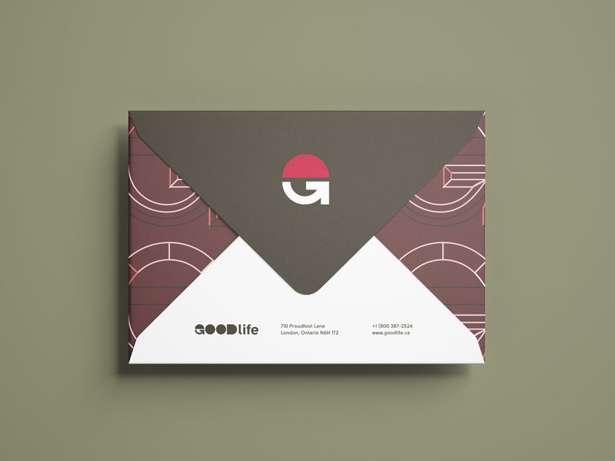
Business Communication Package
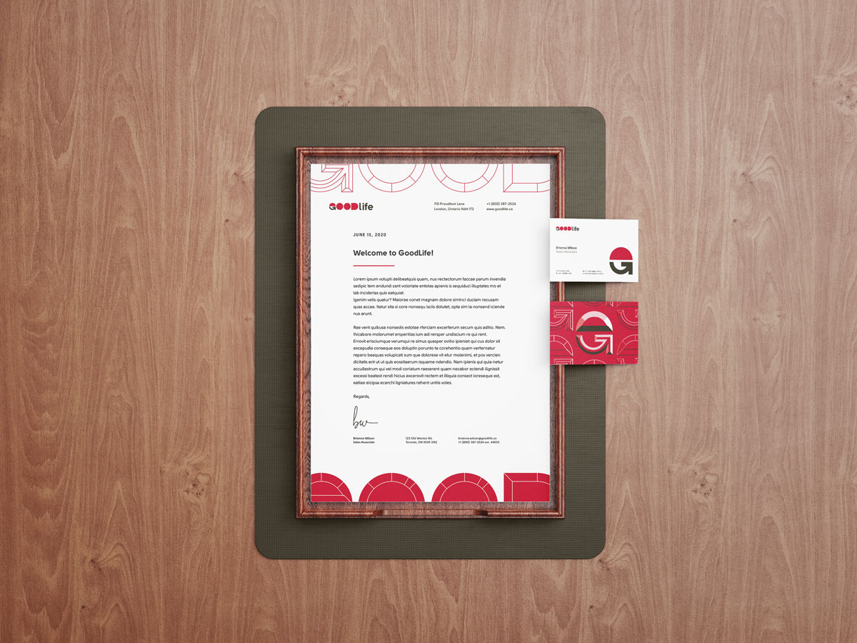
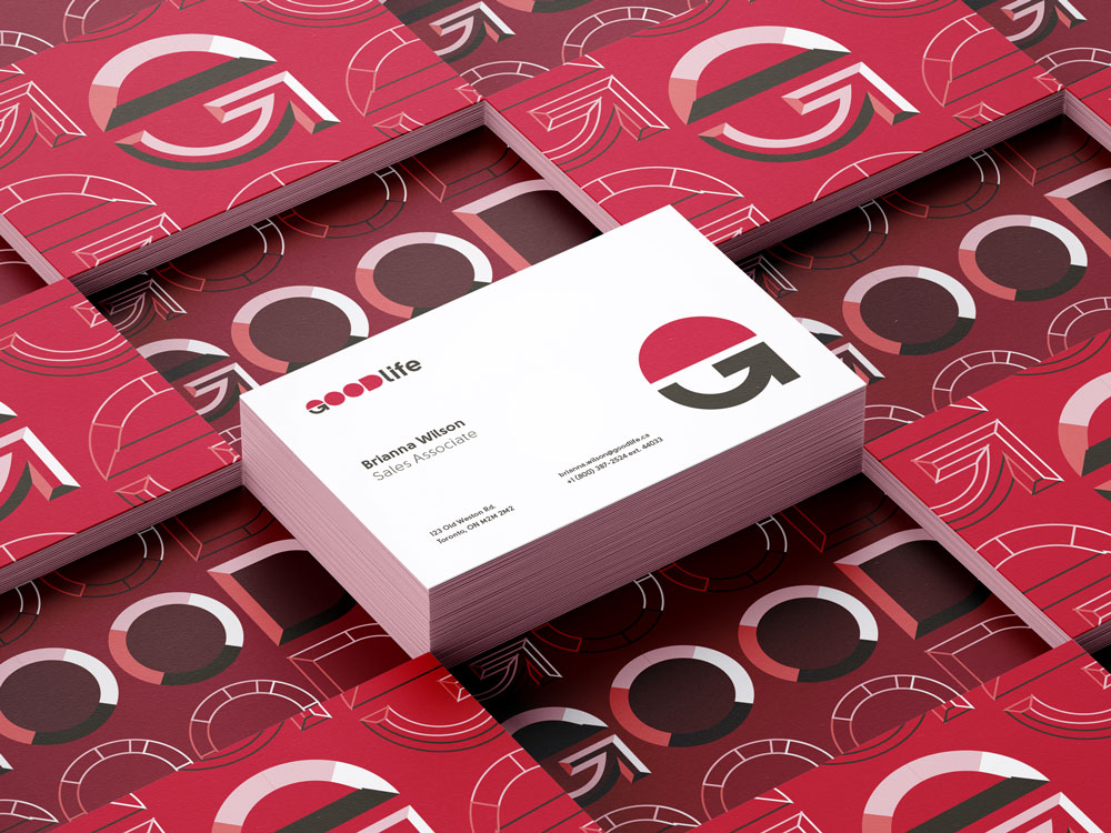
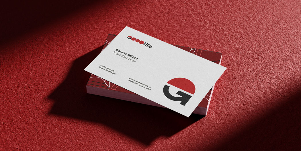
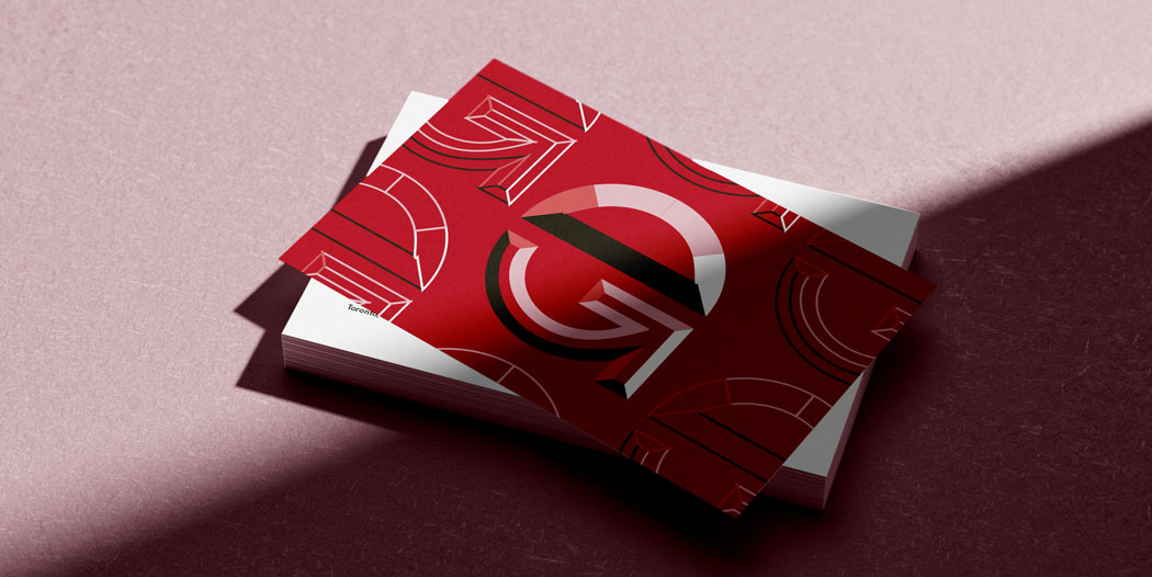
The business cards follow a 3-column grid layout and contains relevant staff contact information.
The letterhead design features oversized, stylized main mark's as the header and footer. Opposite fill and stroke colours for both main mark's to visually balance letterhead.
The envelope design uses two-tone colours for seal and bottom flap. Bottom flap contains the company's brand signature and contact information, and the receiver's address. Receiver's address could also be placed on the envelope face as well.
DELIVERABLE
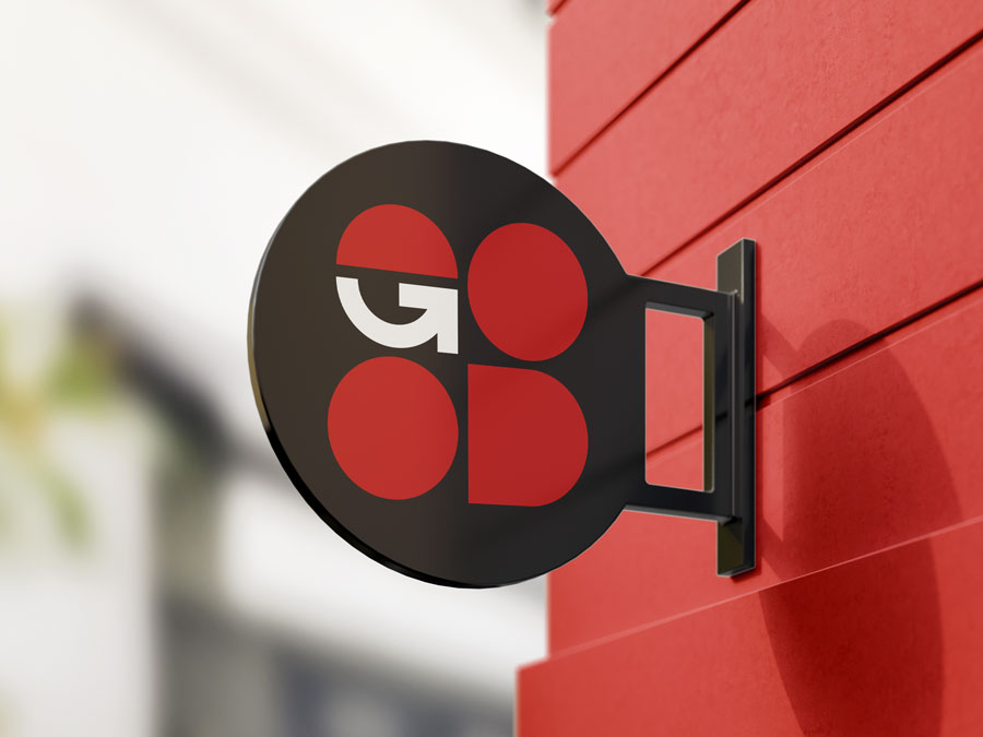
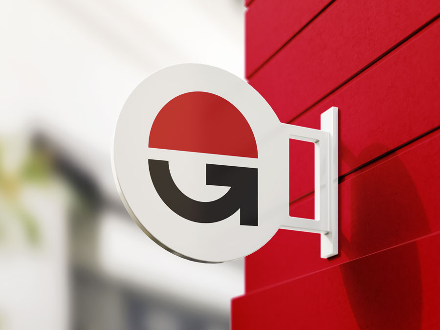
Environmental Design
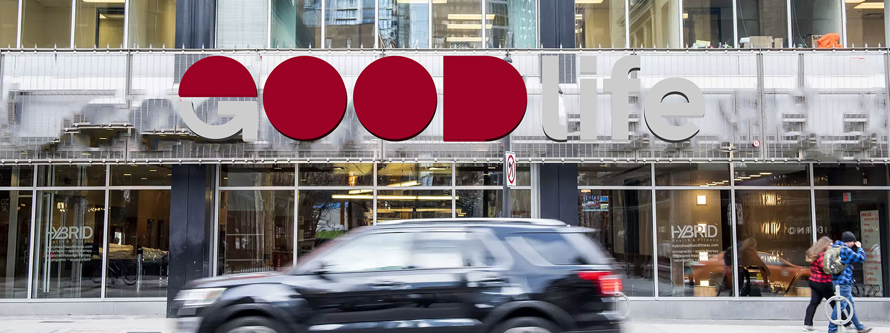
Exterior signage mock-ups for GoodLife club locations featuring the re-designed brand signature, stacked main mark, and brandmark.
DELIVERABLE
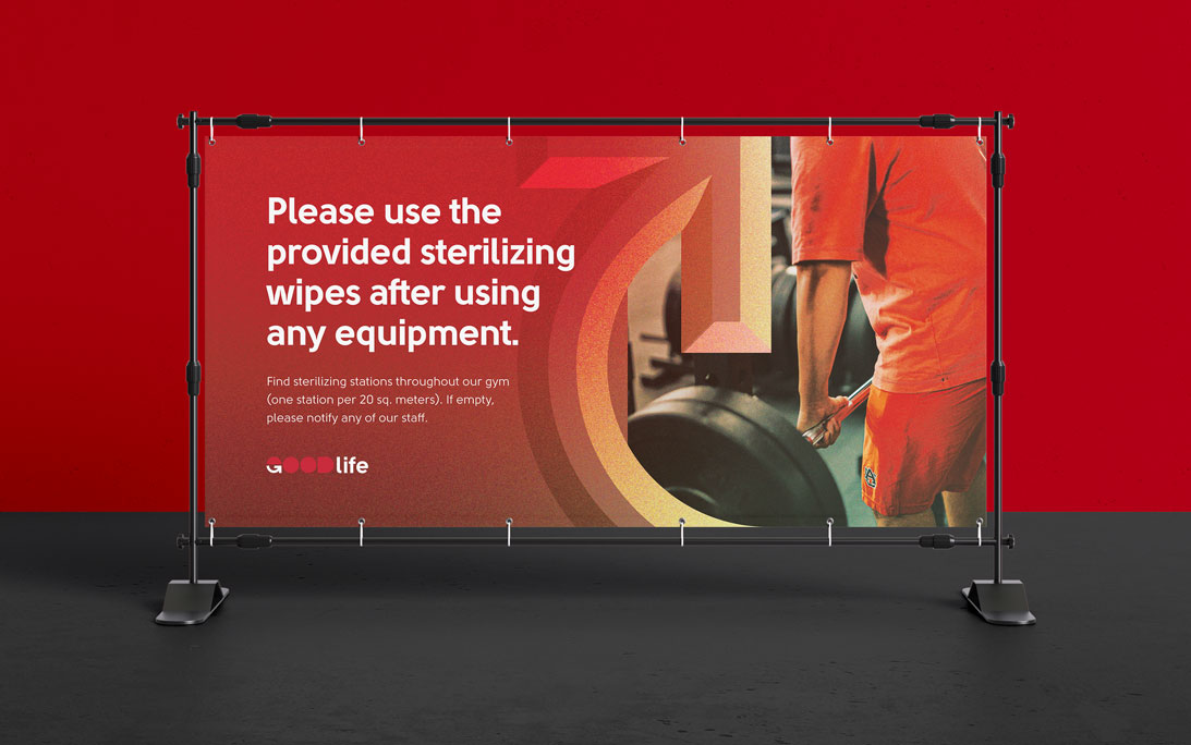
Indoor and Outdoor Signage
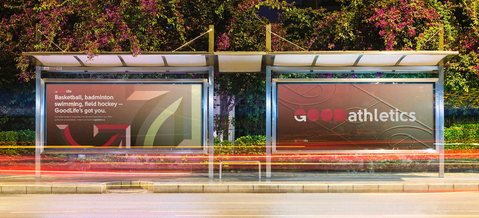
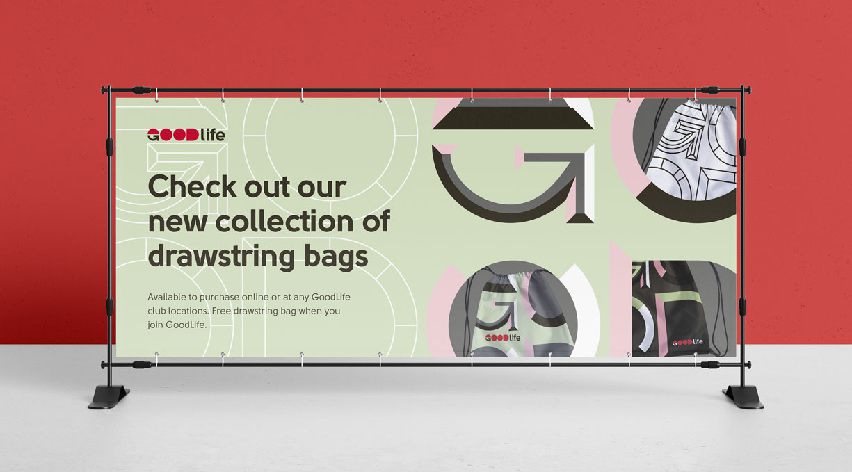
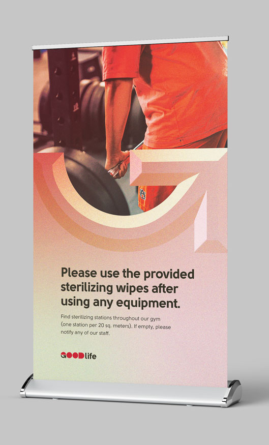
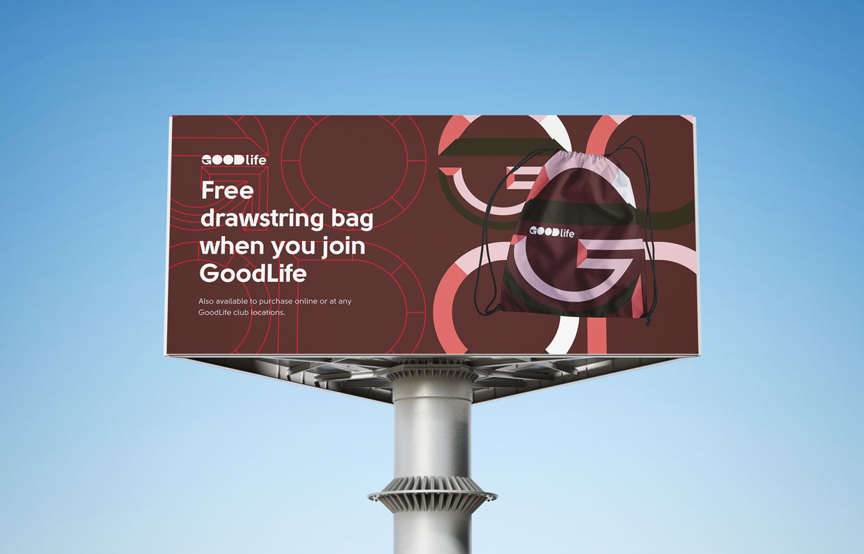
Outdoor and indoor signage and printed promotional material.
DELIVERABLE
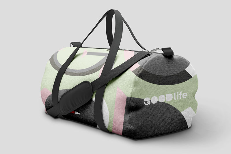
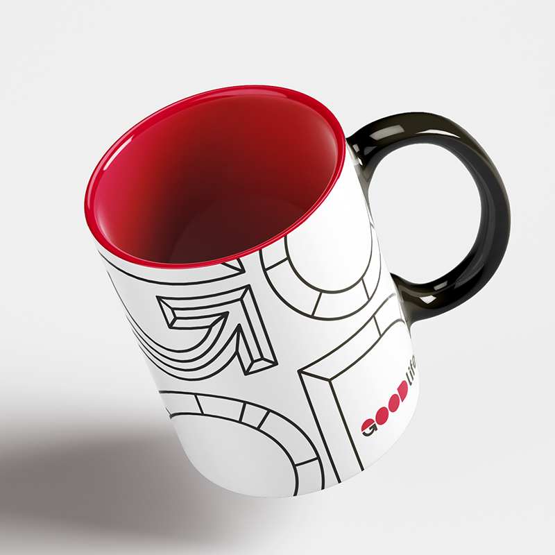
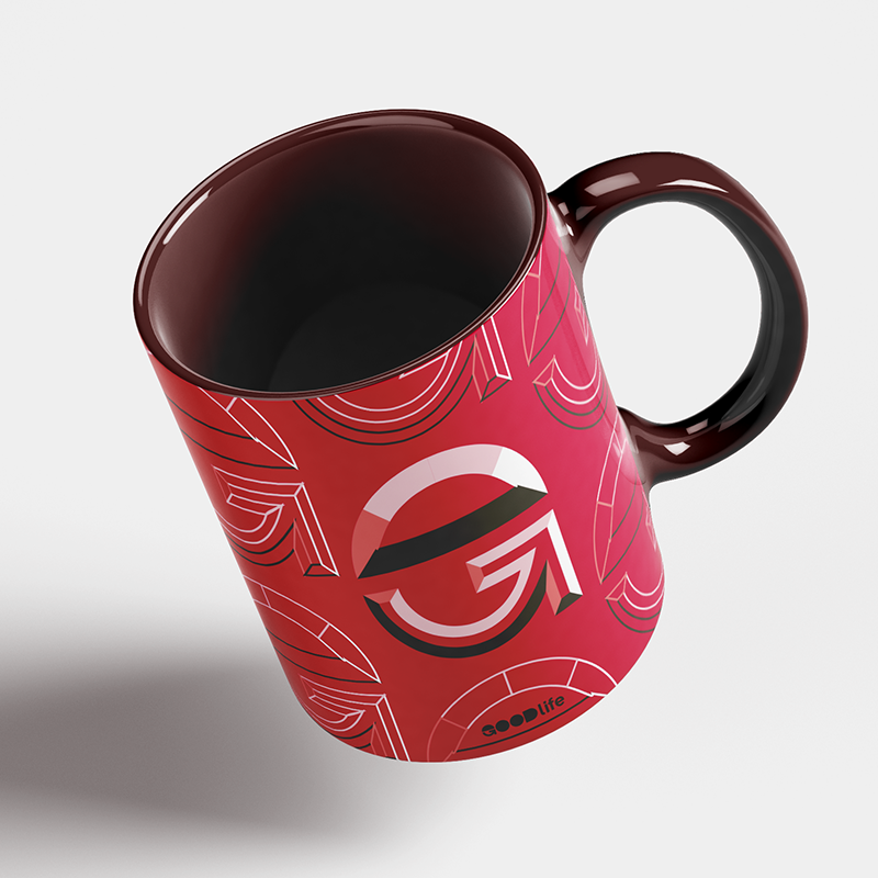
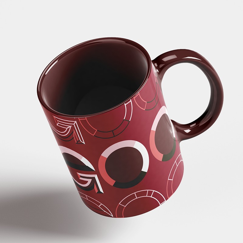
Merchandise and miscellaneous
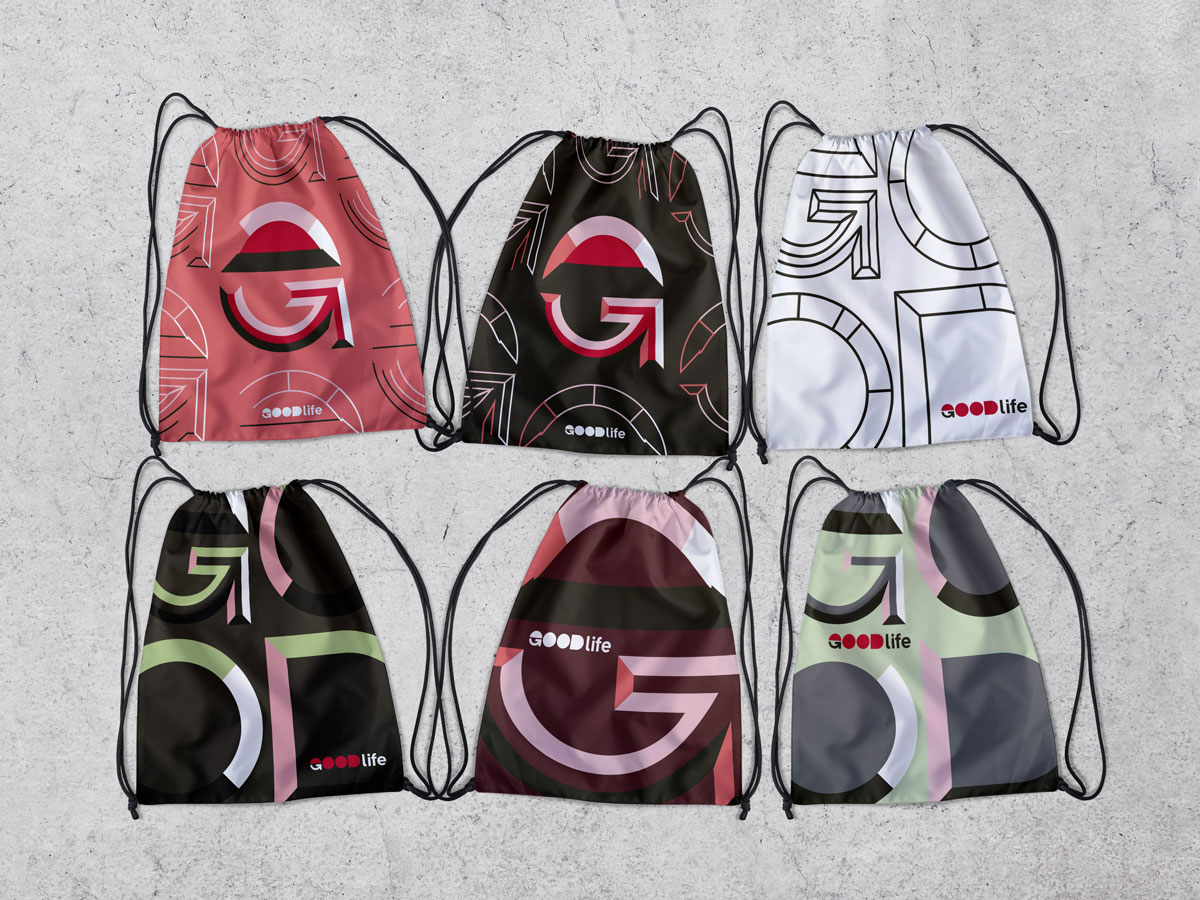
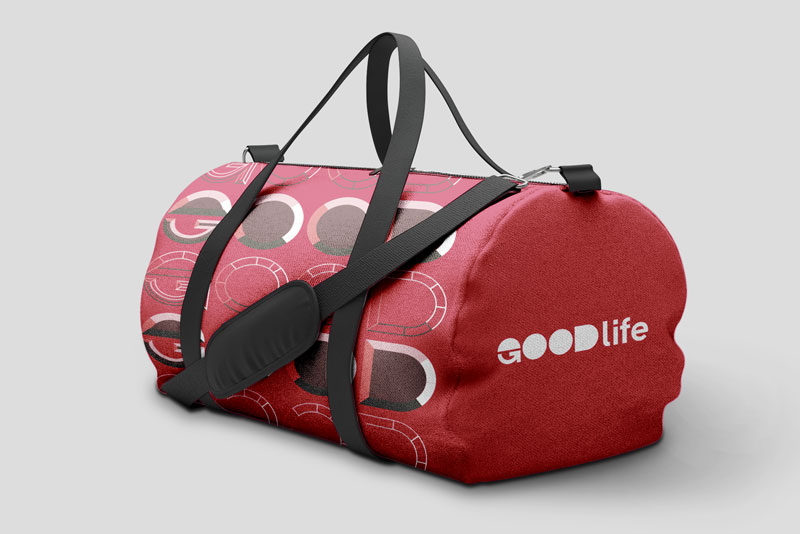
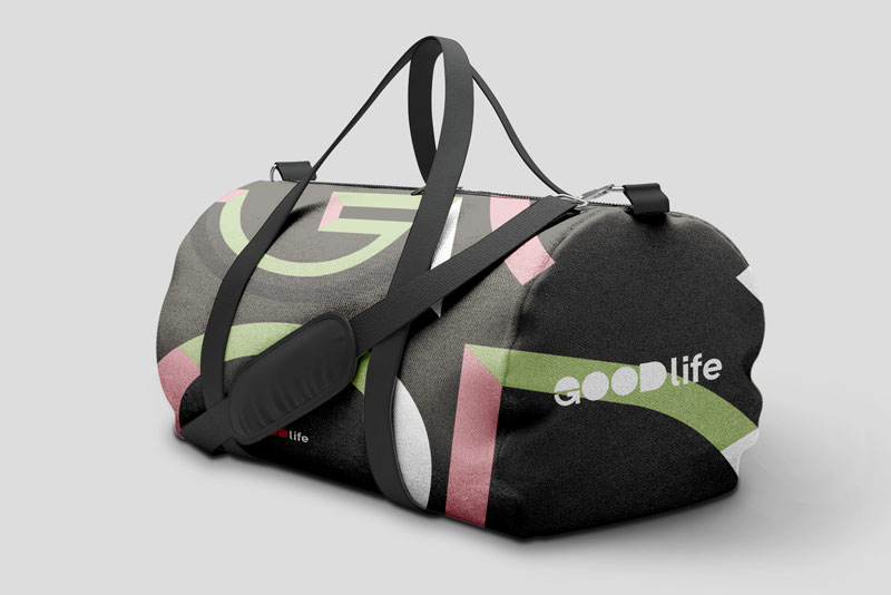
Featured merchandise and miscellaneous deliverables.
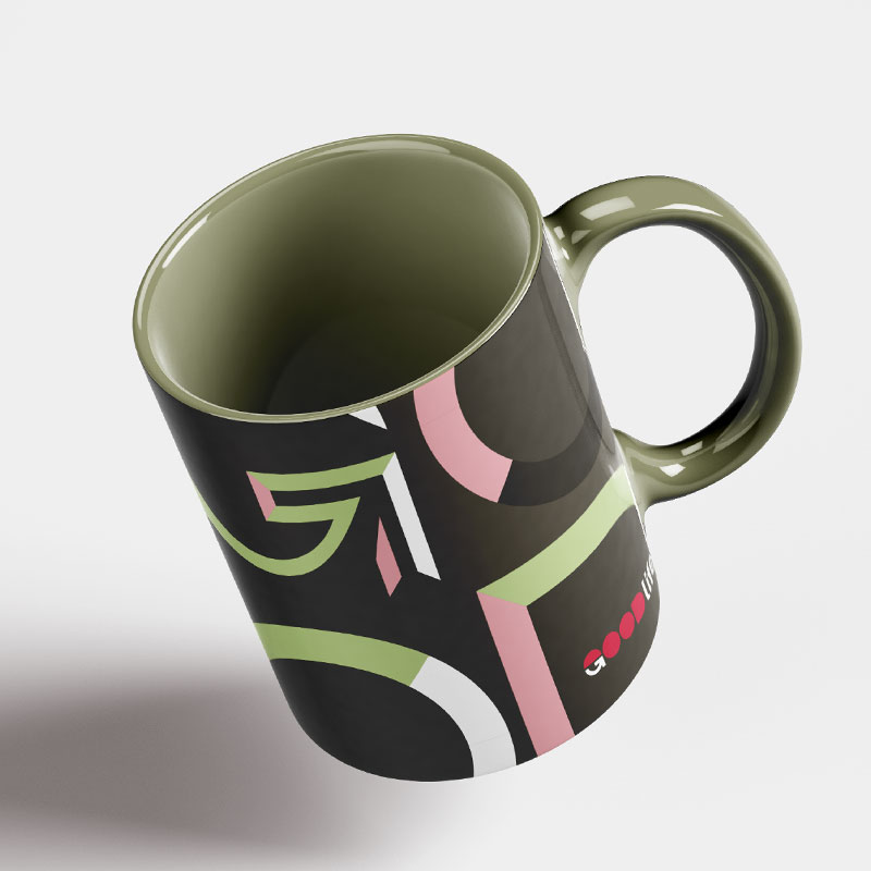
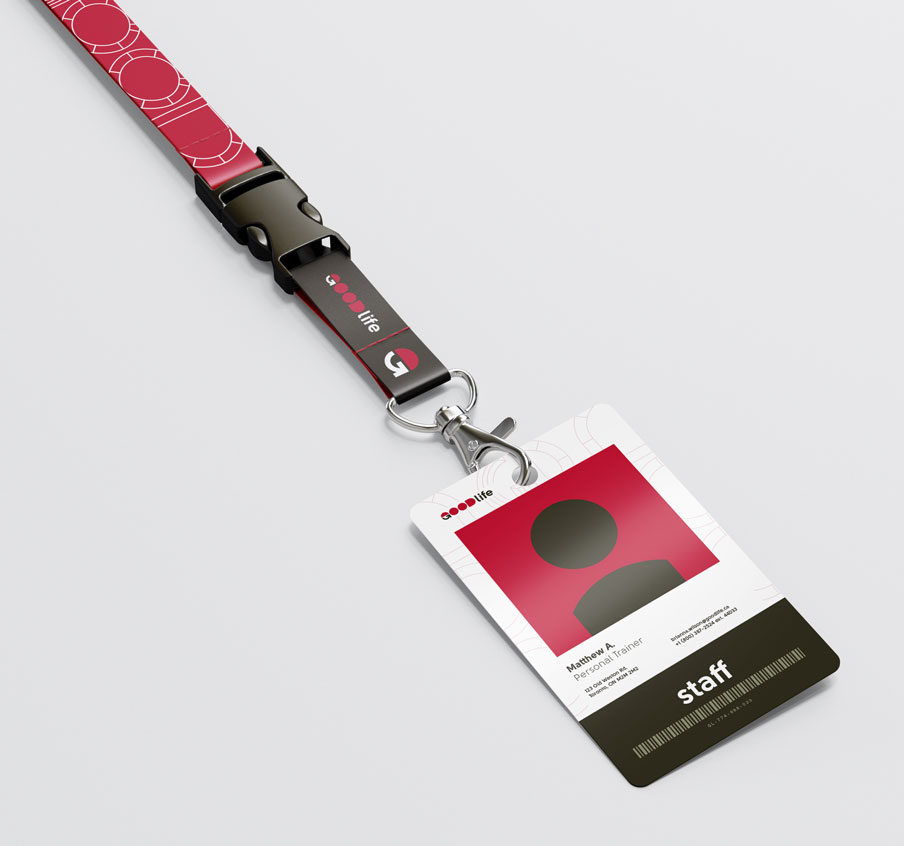
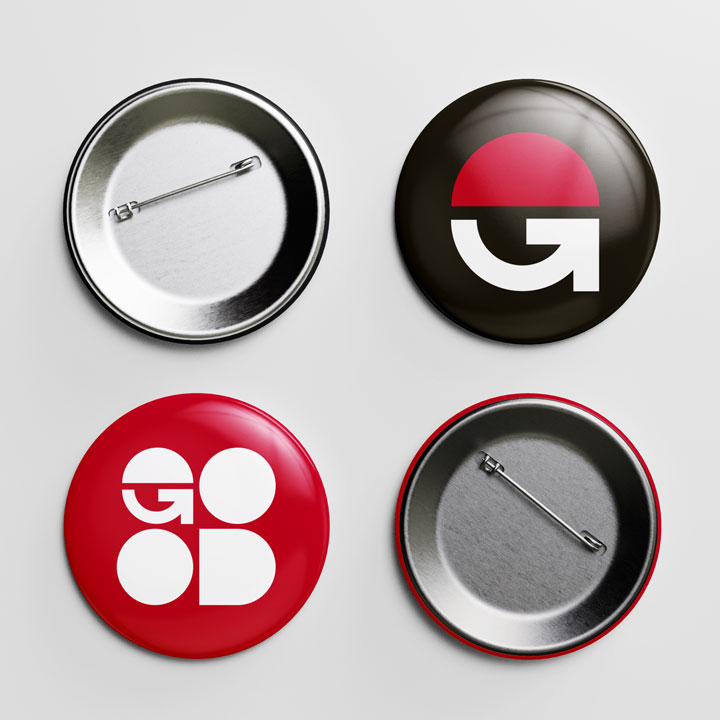
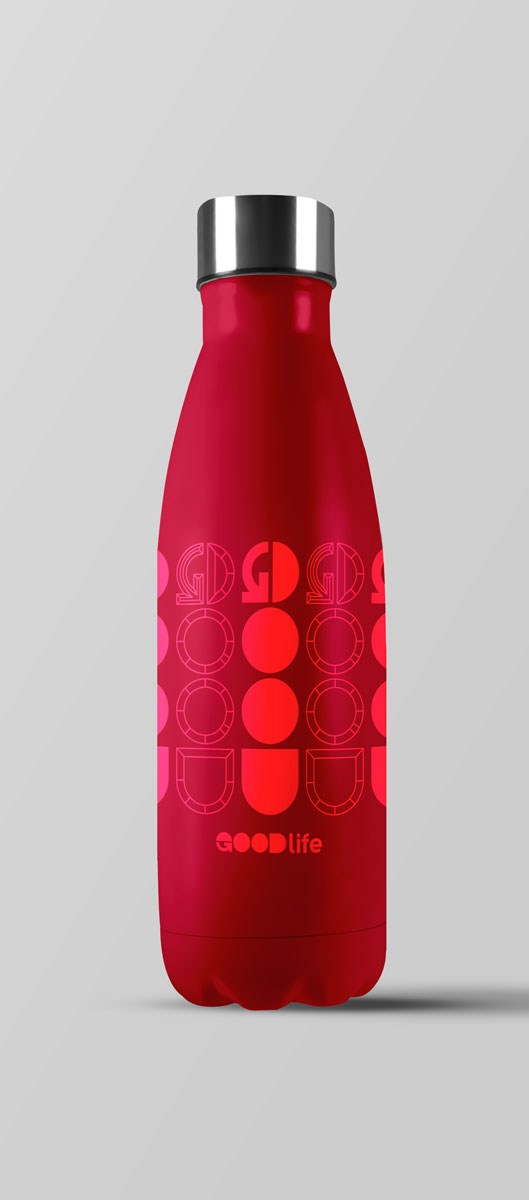
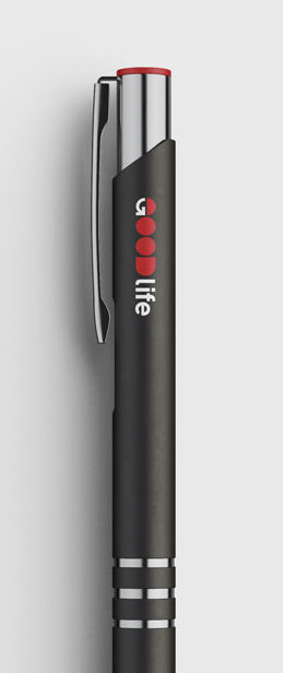
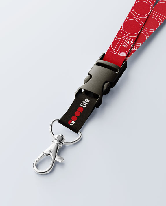
Mock-ups of drawstring bags and duffel bags, lanyard, staff identification card, mugs, water bottle, pen, and pin buttons featuring the range of patterns to choose from.
Check out my other work!
DITHER Experimental Digital Arts FestivalBranding & Motion
Division of Students — York UniversityBranding, Communication
They Are Watching: Internet PrivacyInformation Design & UX/UI
York Lions & Athletics and RecreationBranding, Communication

PullThru — Collaborative Event Scheduling AppUX/UI & Branding

Save The InternetBranding & Communications
Logos: Volume OneBranding

Expense vs. EgoCommunications
2048 AnimatedMotion

Semiotic PostcardsCommunications
© 2024 Jordan Campbell | Always learning. Always growing.
