PROJECT
DITHER Experimental Digital Arts Festival
YEAR
2018–19
CATEGORY
Branding,
Motion Design
SYNOPSIS
Through 3 deliverables, create and develop a multilingual visual identity for an imaginary festival.
Overview
The DITHER Experimental Digital Arts Festival is a fictional international initiative dedicated to showcasing the best of digital arts, technology, and creative media practices. Presenting works across a dynamic range of exhibitions, curations, screenings, performances, lectures, and workshops.
The goal for DITHER is not only to showcase experimental artwork, but also to connect emerging and established curators, artists, and institutions to forge international networks and generate new forms of visual design, methods research, and how it can solve real-world problems.
Final
Deliverables
Throughout the visual development, I had an affinity with RGB (red, green, blue) lighting, and the relationship between digital and organic environments. This was a great opportunity to explore these themes further by implementing them into DITHER's visual identity.
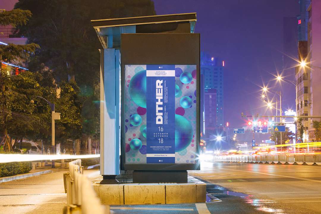
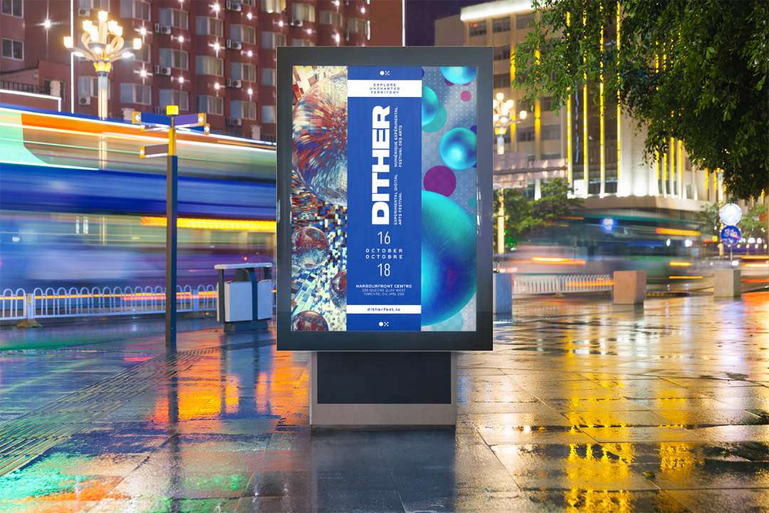
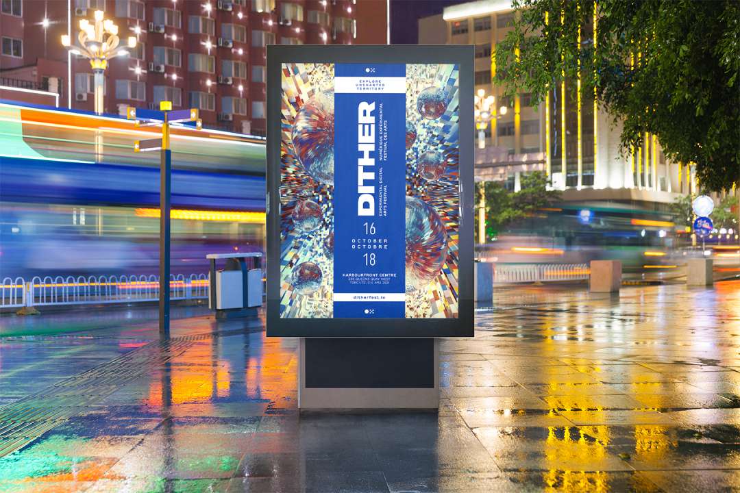
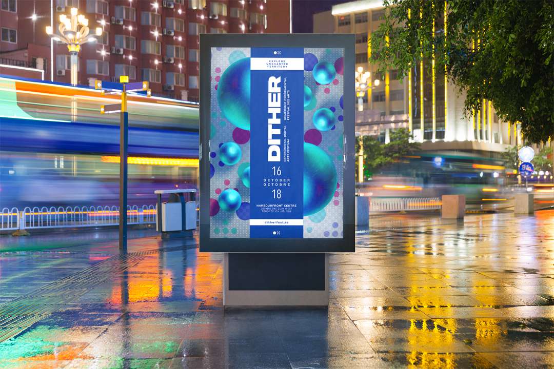
FINAL PRODUCT
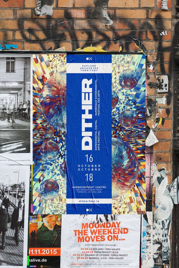
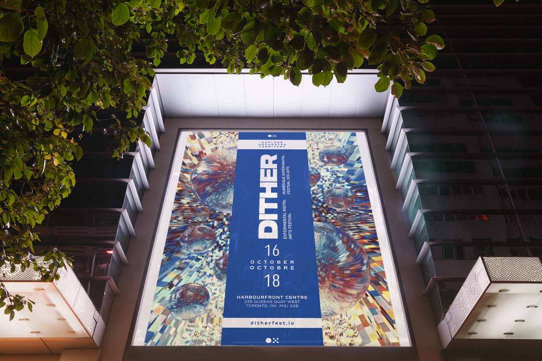
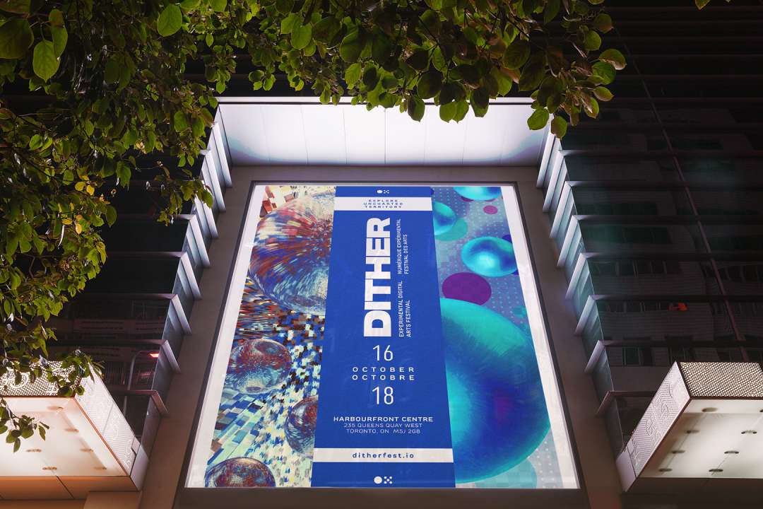
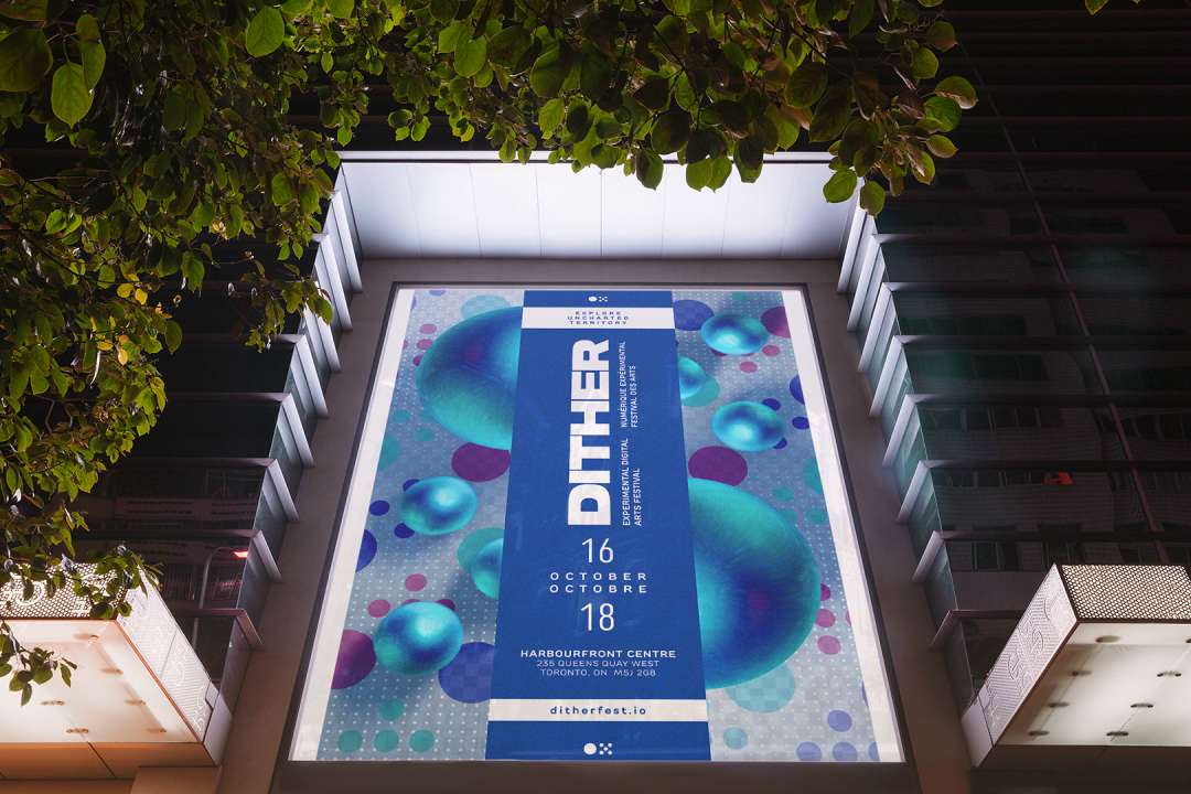
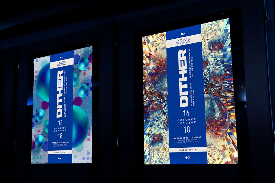
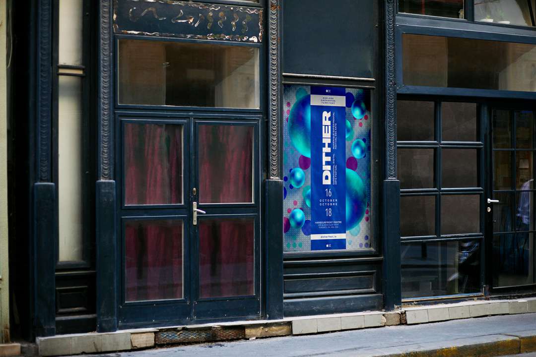
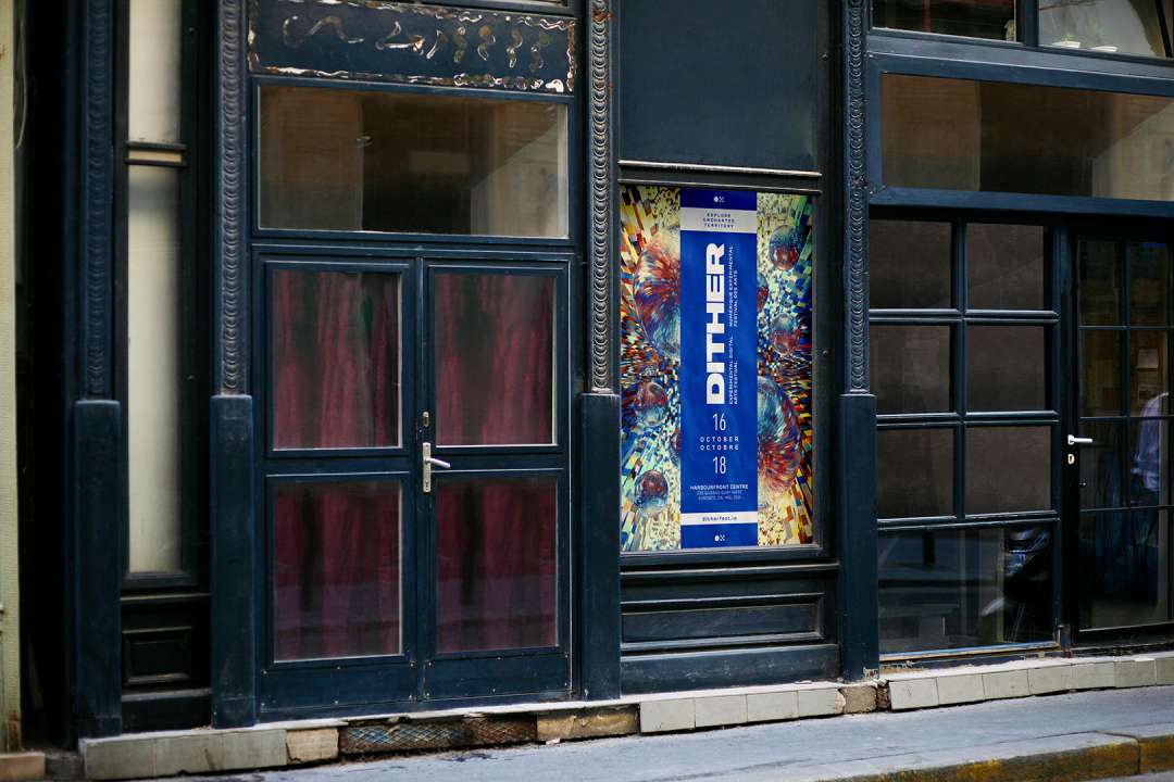
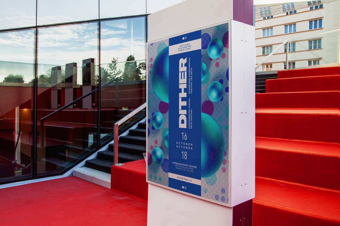
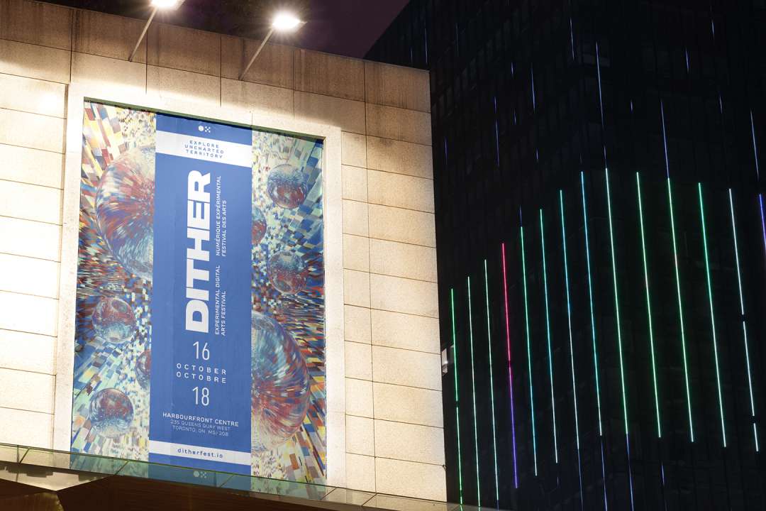
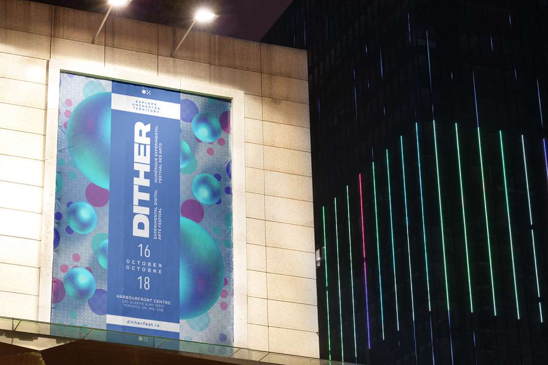
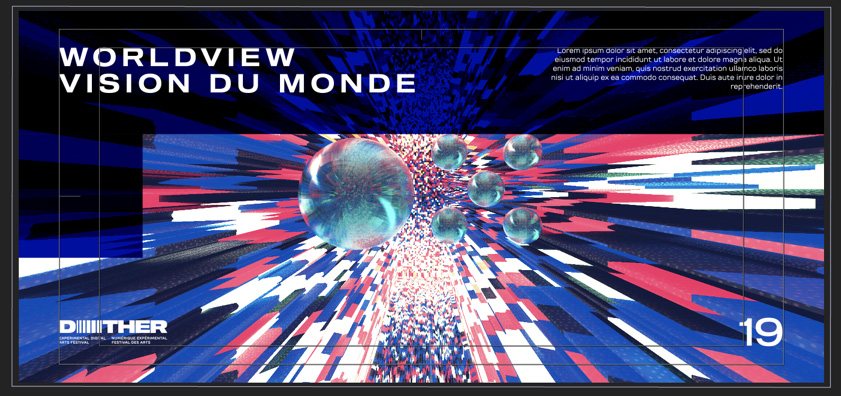
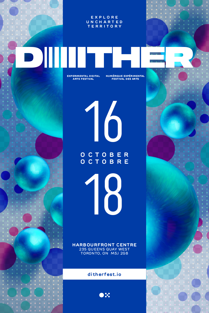
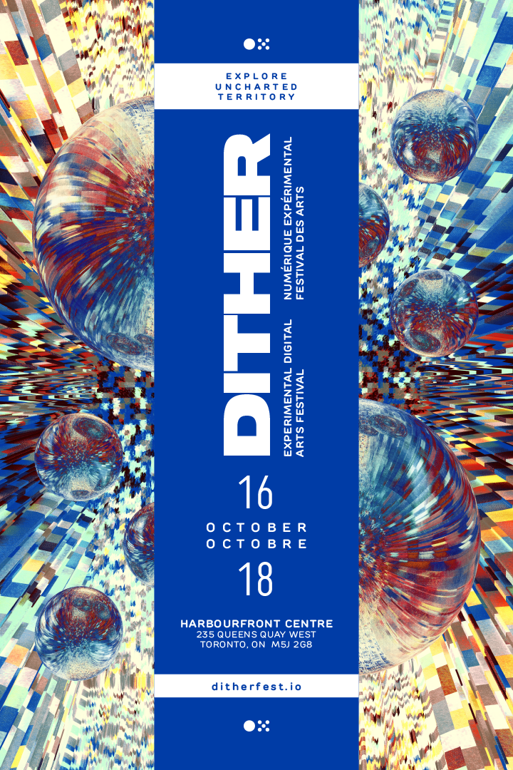
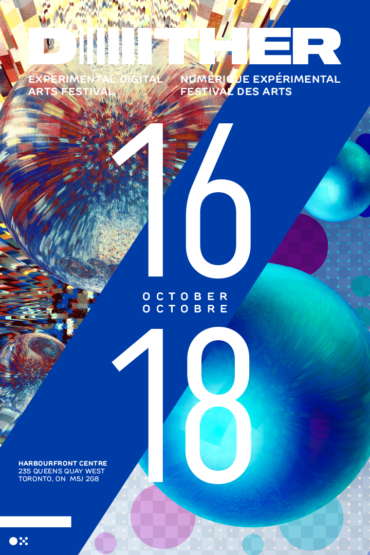
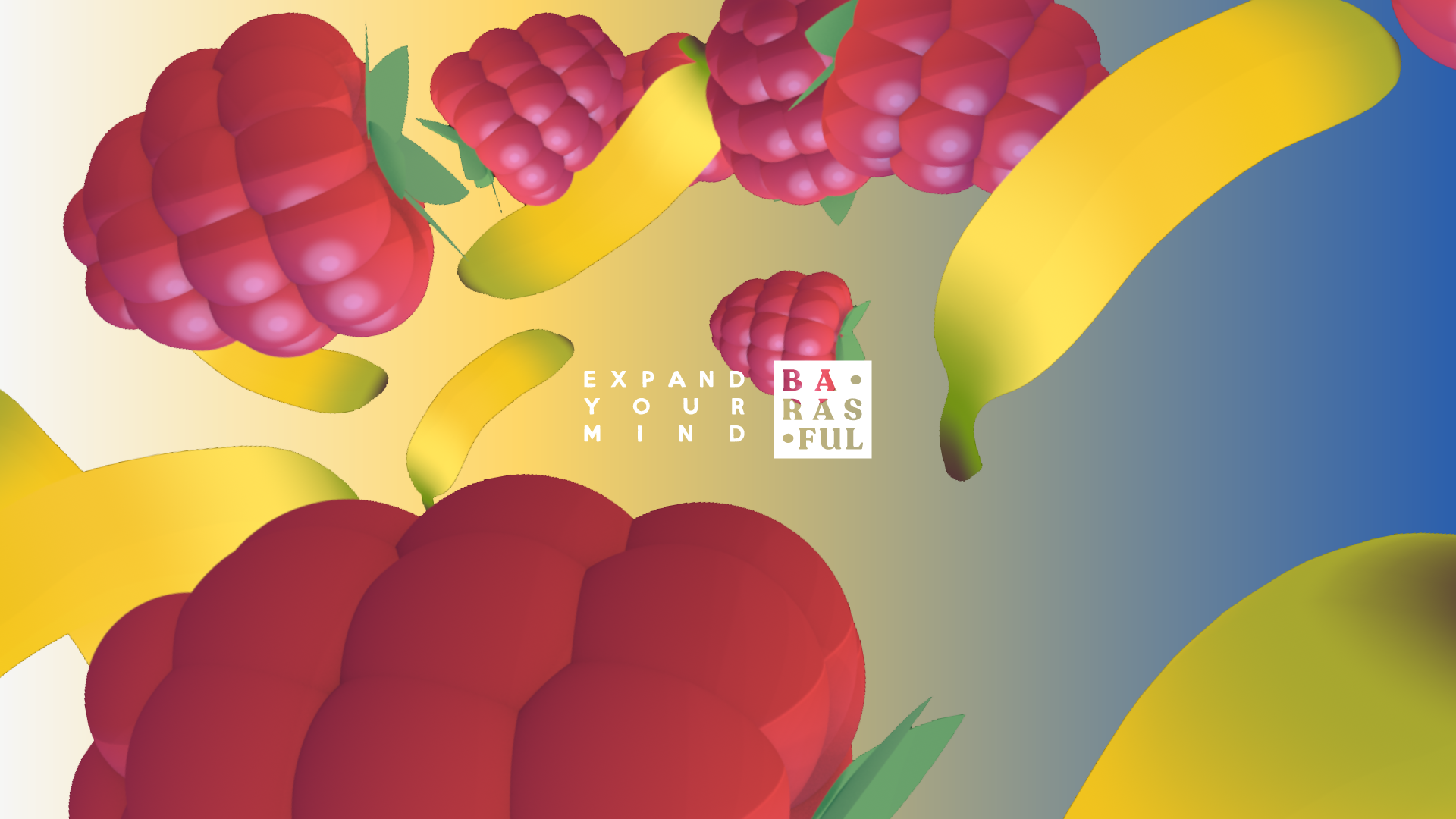
Promotional Posters
Large format poster to promote festival. Mockups of posters in various indoor and outdoor settings.

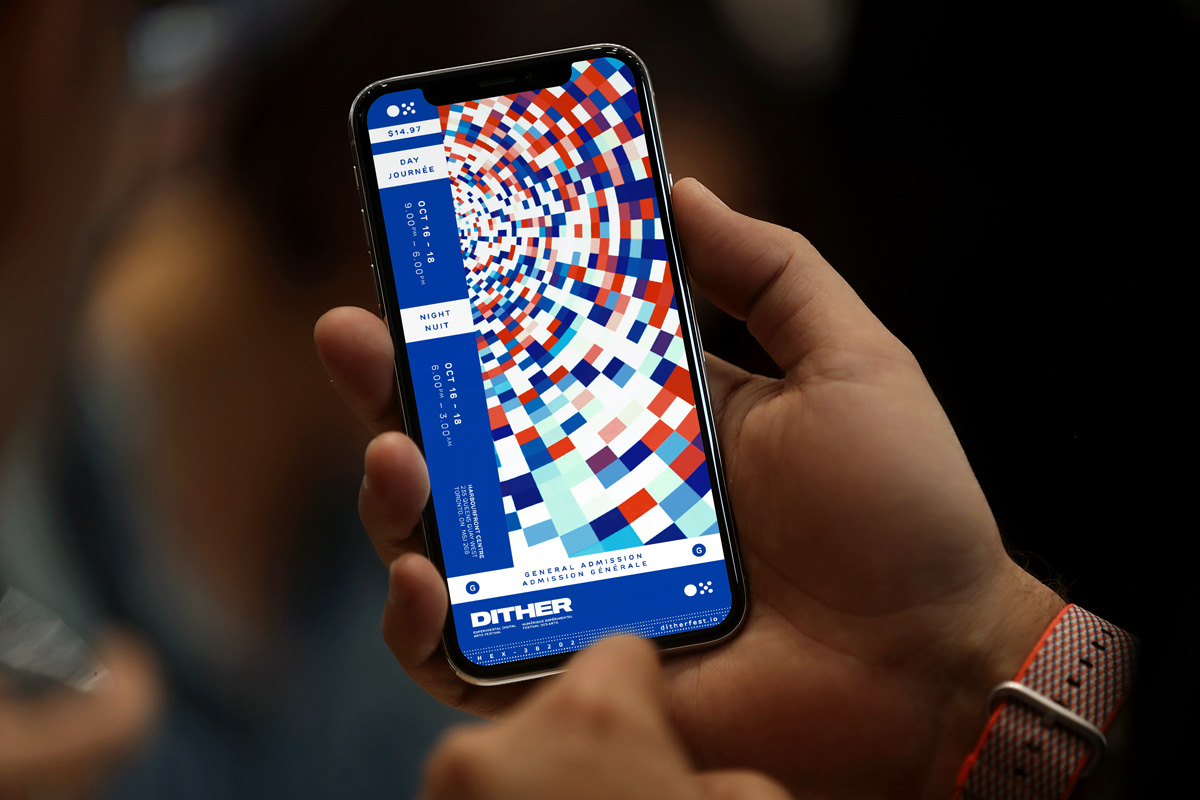
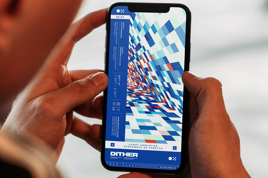
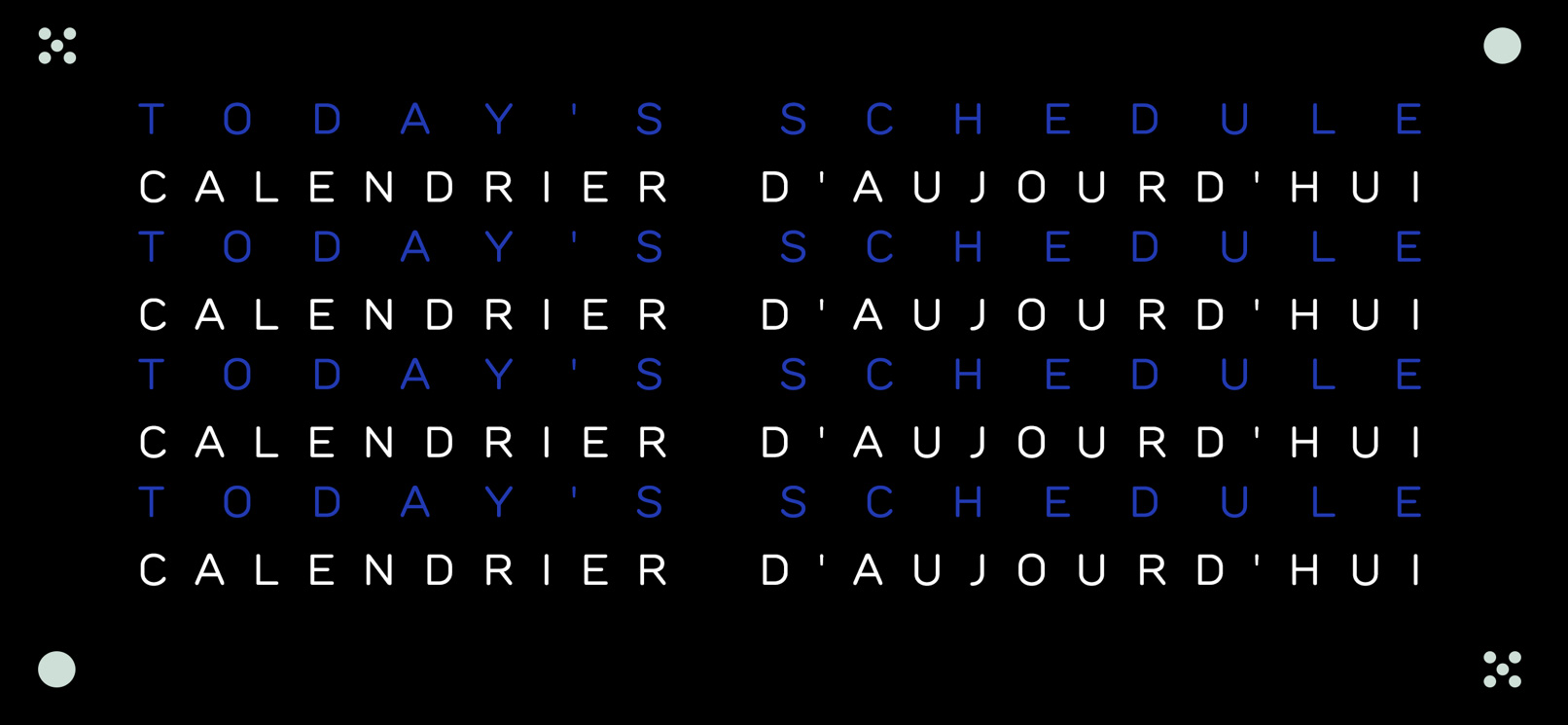
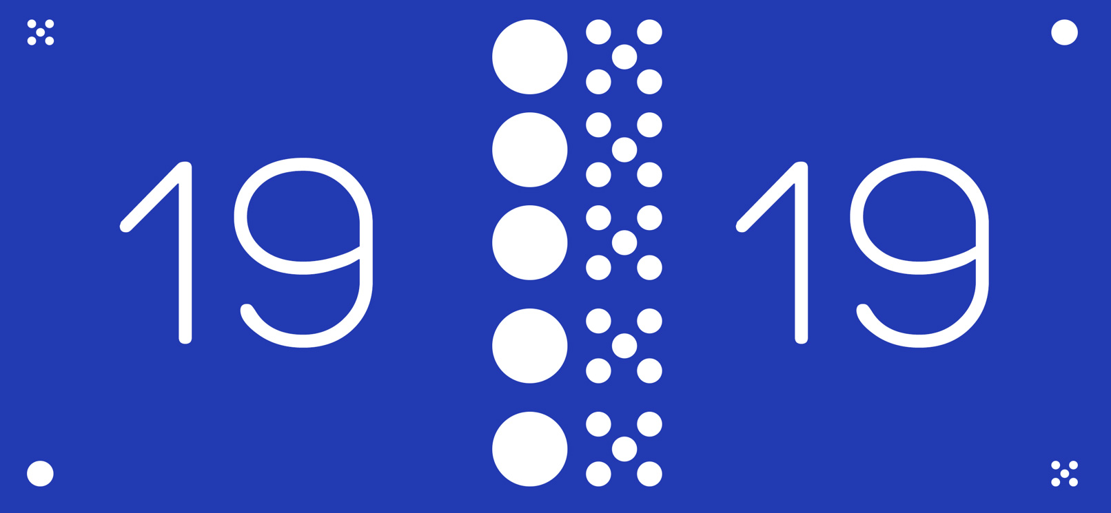
FINAL PRODUCT
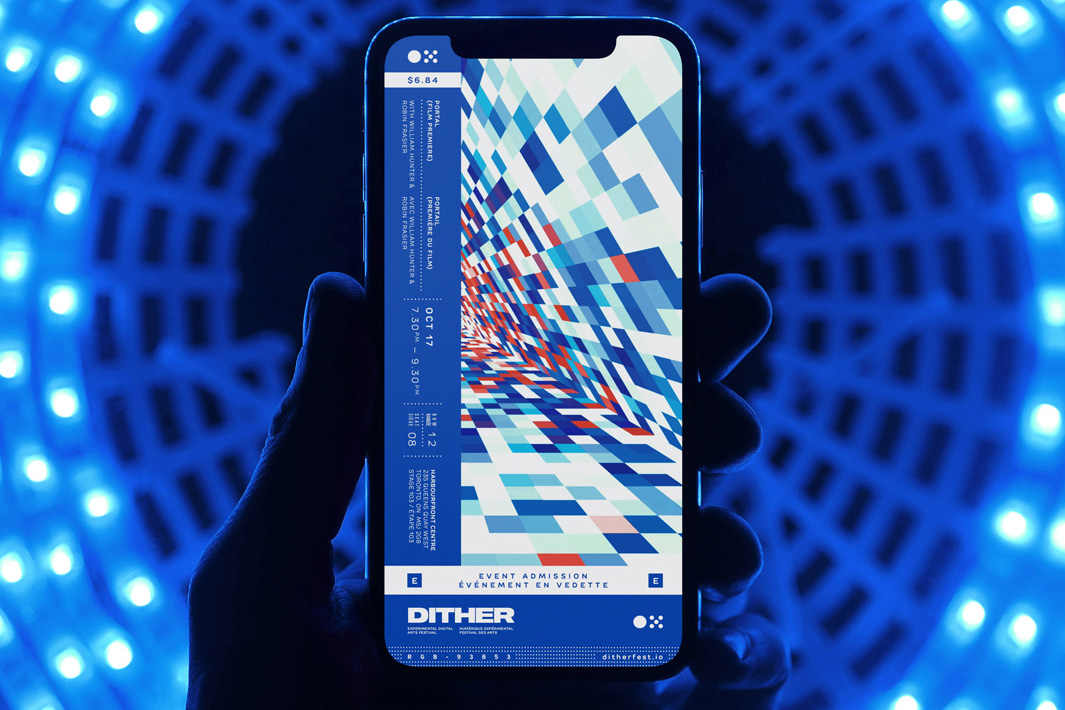
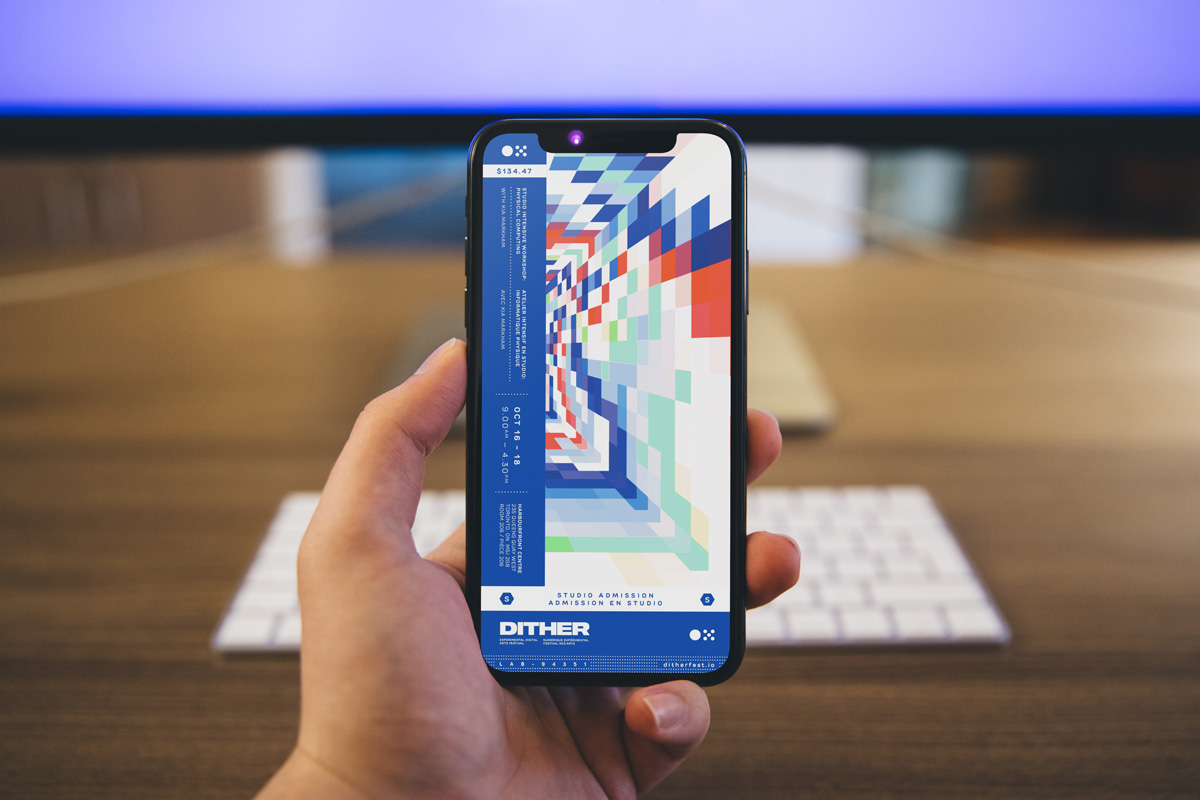
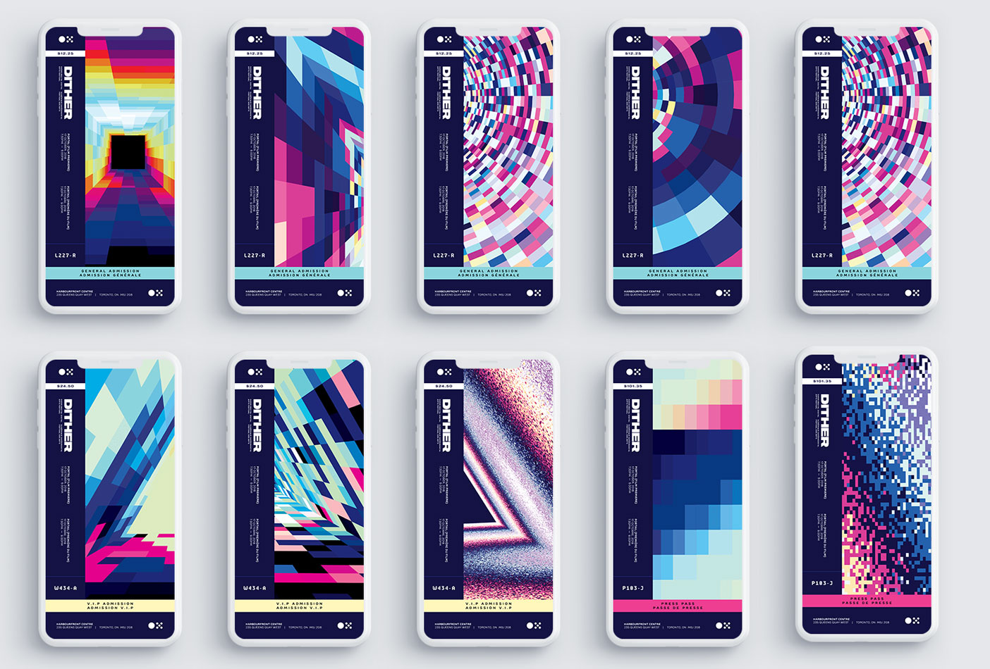
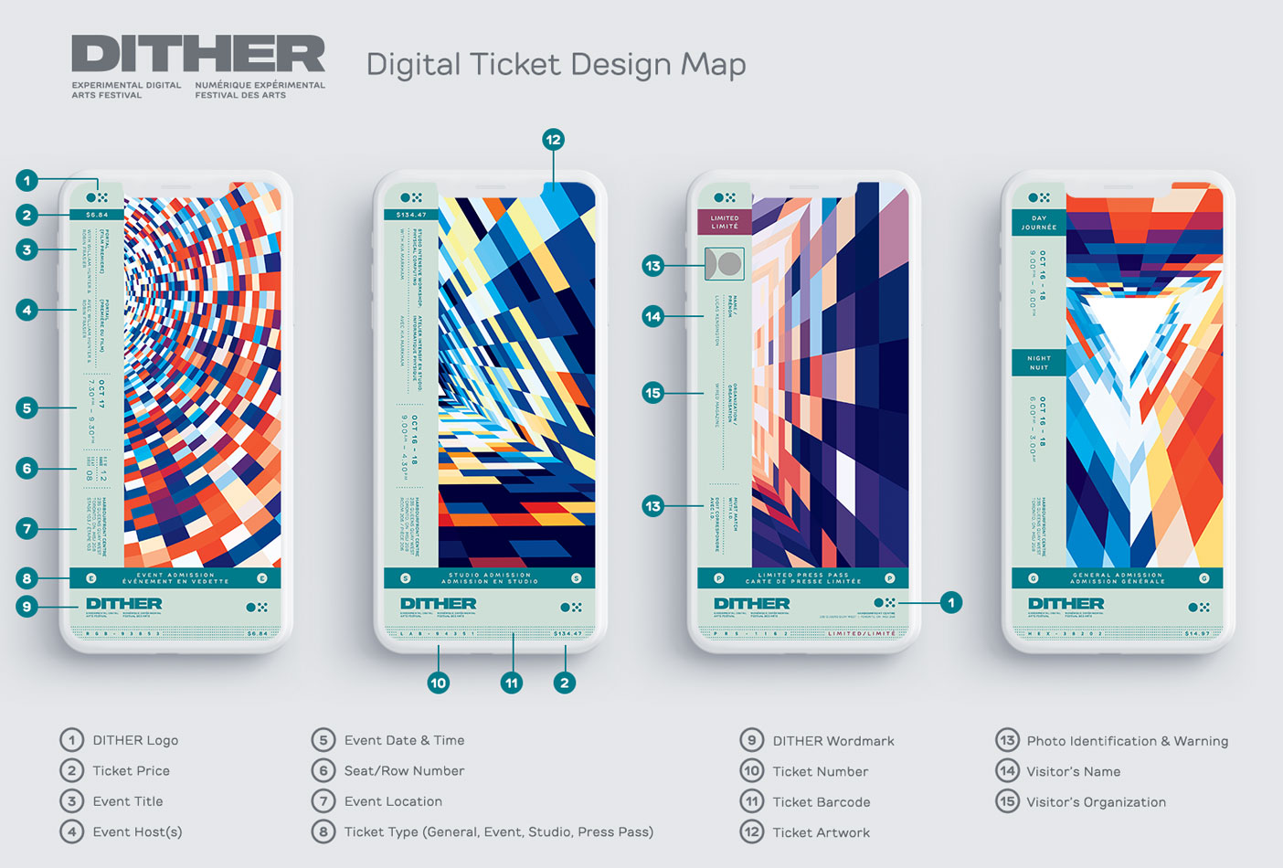
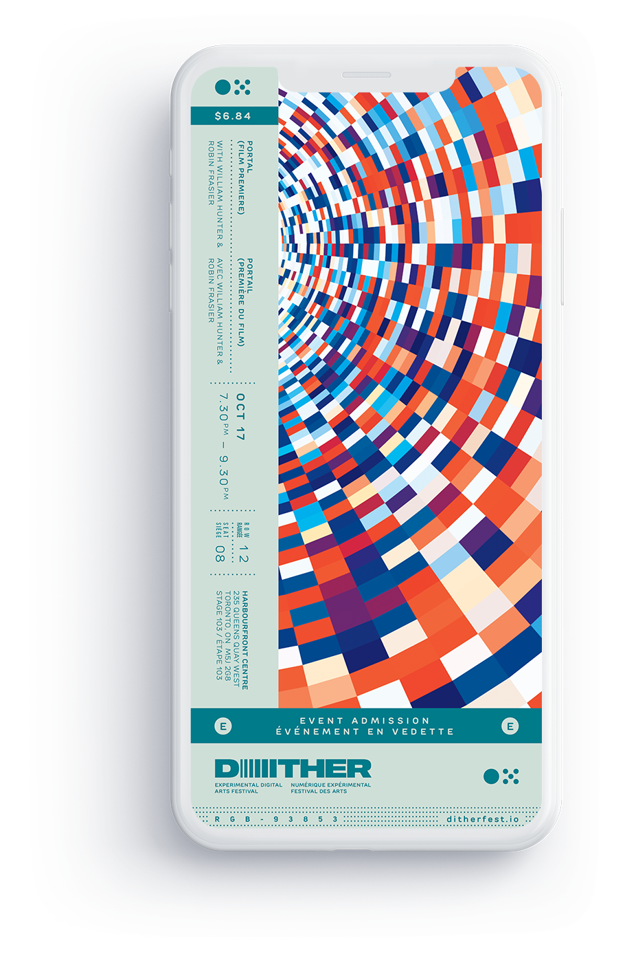
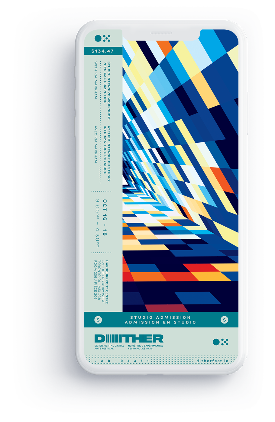
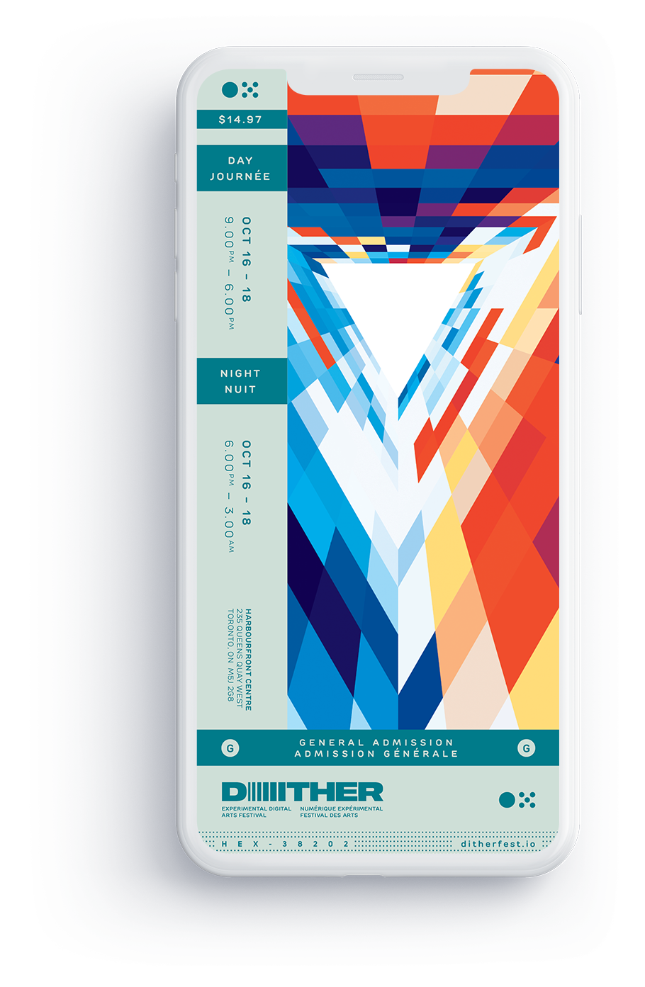
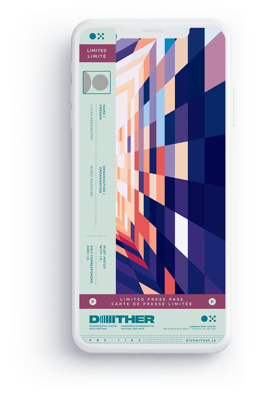
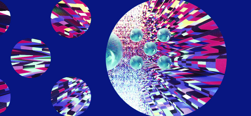
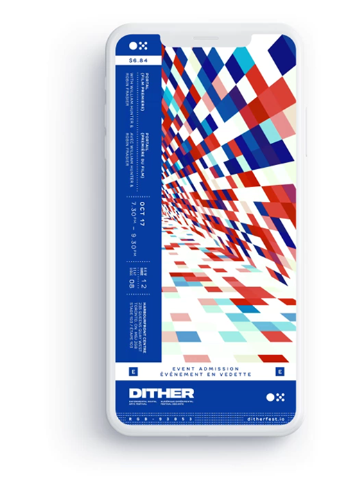
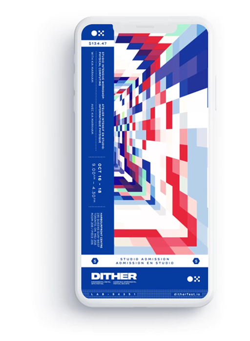
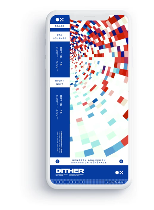
Animated Digital Tickets
Designed animated digital tickets made for smartphone displays in lieu of printed ones. Artwork influenced by final poster design and RGB lighting.
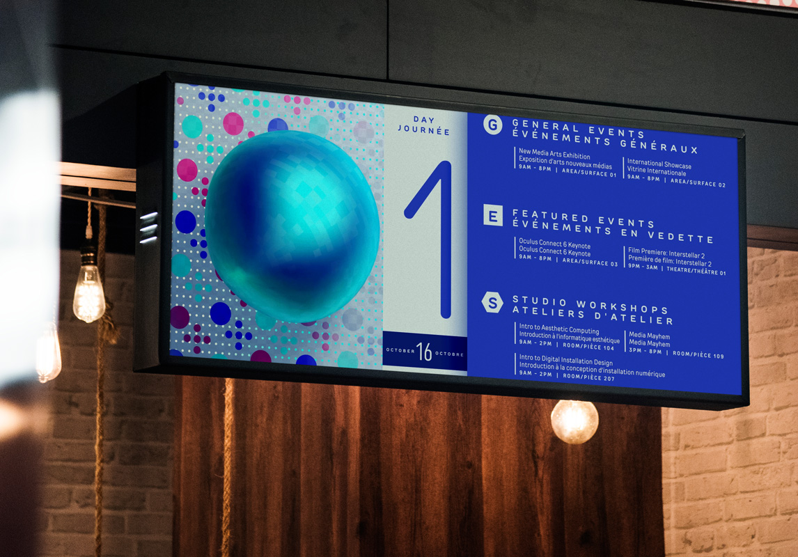
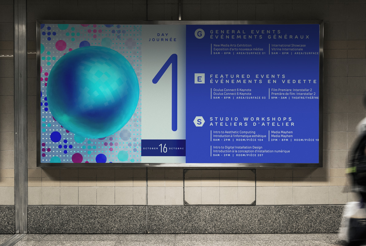
FINAL PRODUCT
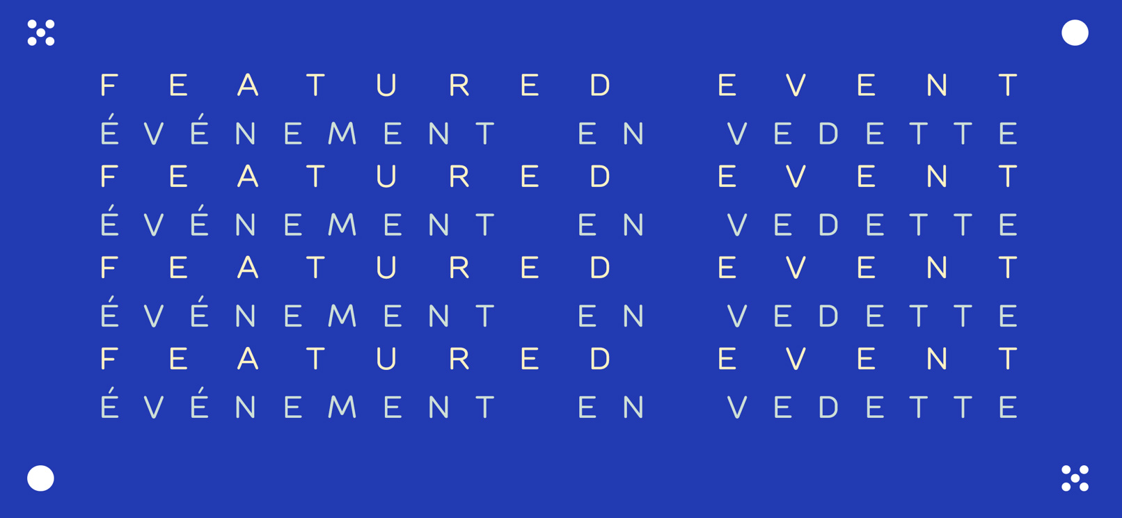
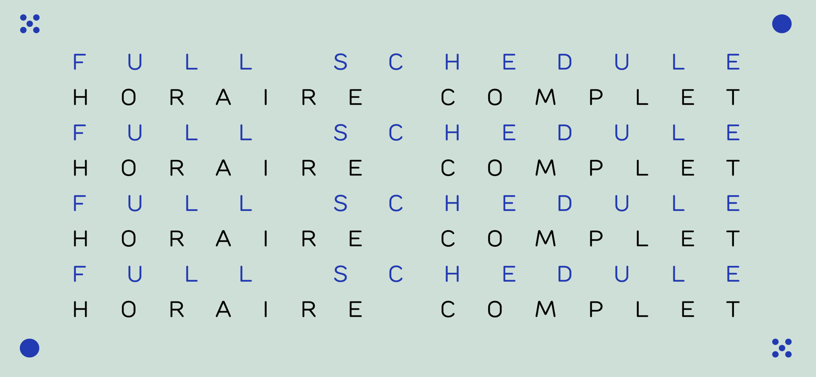
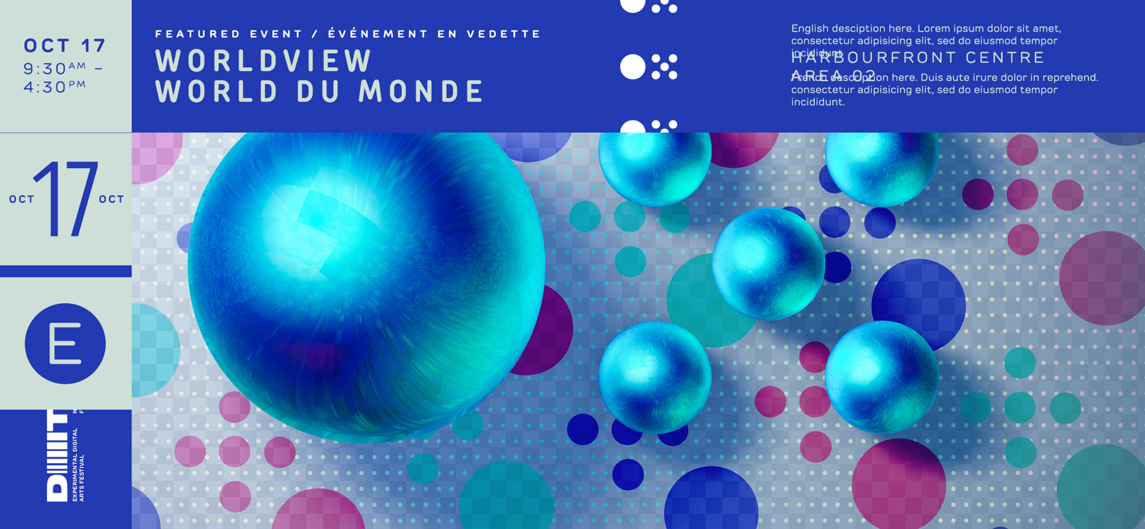
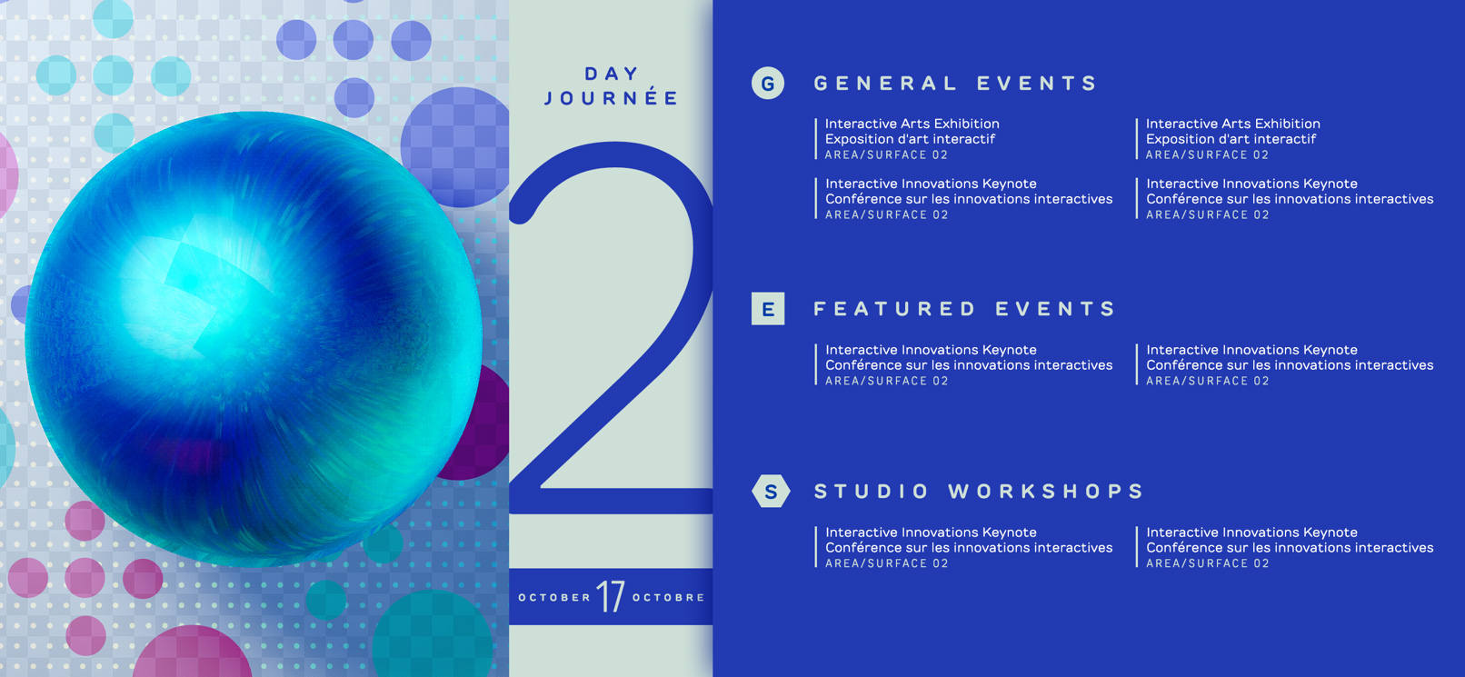
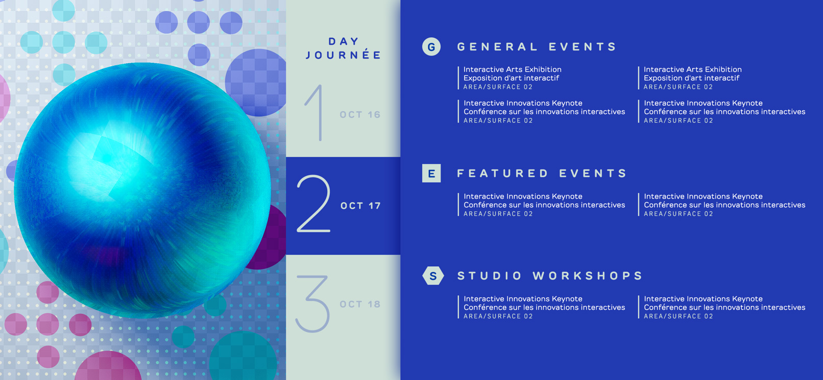
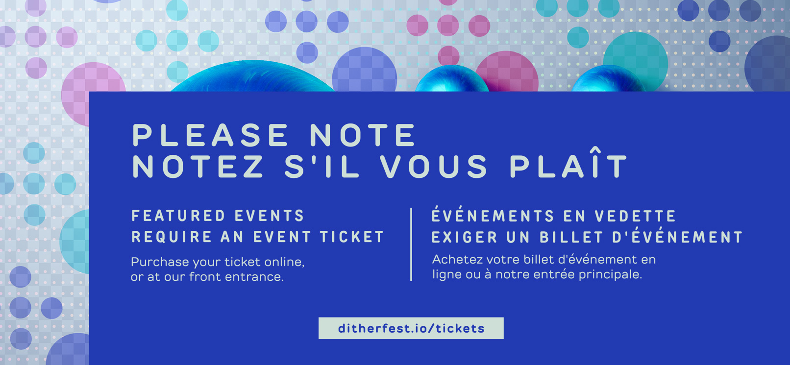
Festival Program Display
Animated festival program display designed for large screens (TVs, monitors, projectors) placed throughout venue. Cycles through all featured events and studio classes available for the day, and features a full schedule.
Process Work:
Research & Development
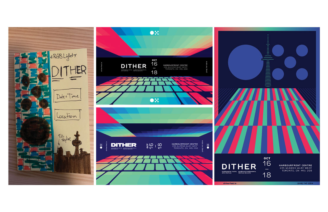
Developed a number of idea that lead to three distinctly different concepts and applied to a poster that would be displayed in public locations. The essence of these designs will become the visual identification for the festival, and will be applied to the other deliverables.
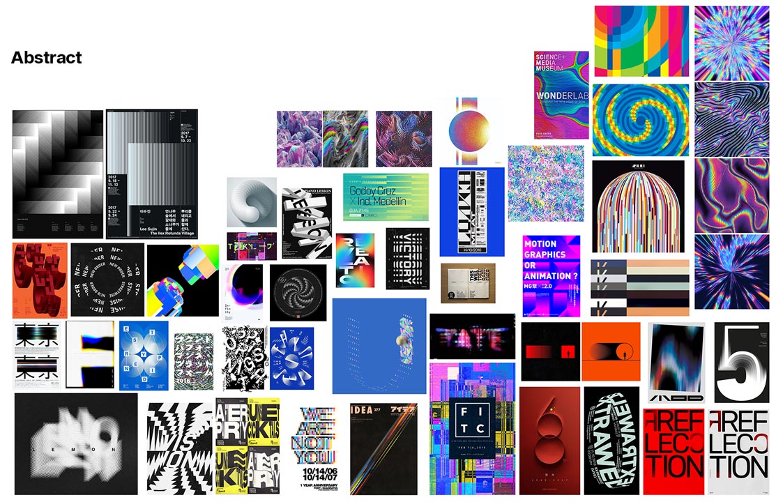
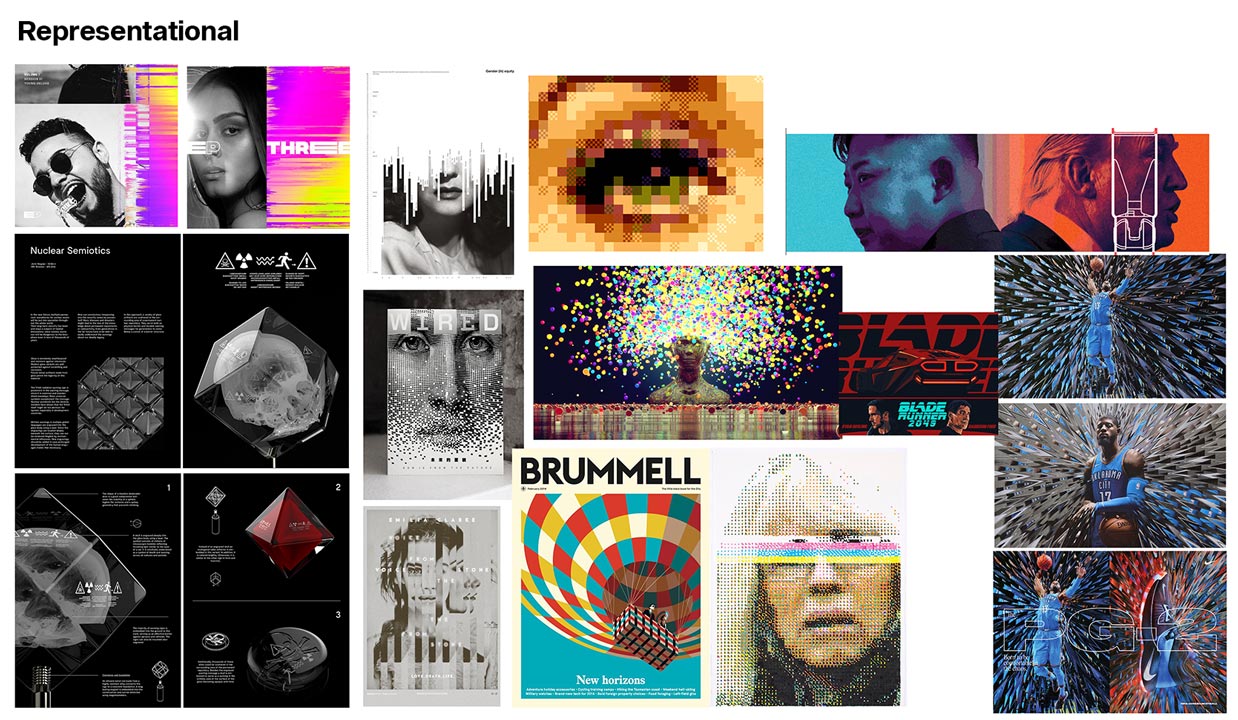
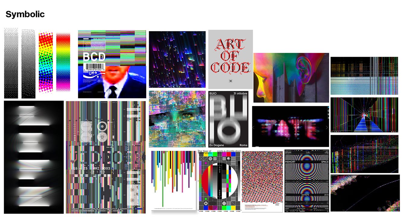
Moodboards
Created three moodboards divided by style (abstract, symbolic, and representational). I wanted to search for artwork that featured lights, motion and computer processes such as dithering, glitching and screen tearing. I ultimately ended up leaning more towards abstract and symbolic.
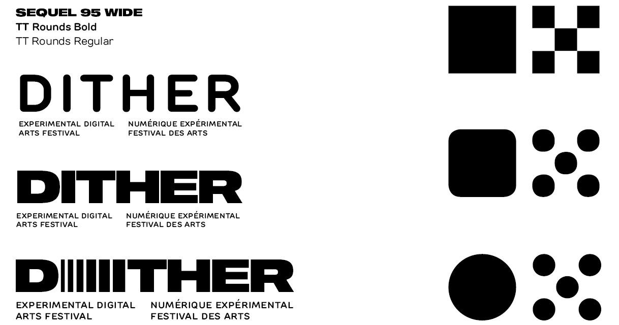
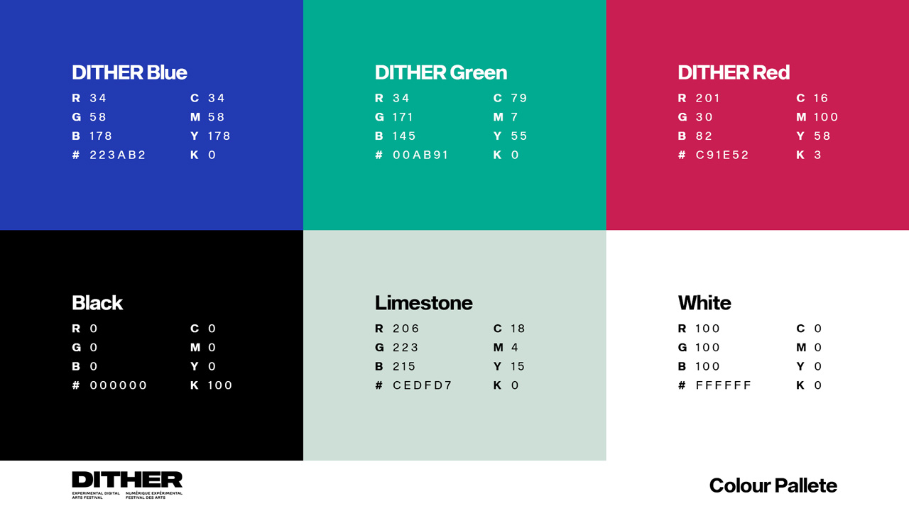
Wordmark, Emblem, and Colour Pallette
I felt it was important to keep the branding tidy and simple. I kept changes to the type minimal throughout the project. For the emblem I modelled it after the computer process of dithering — a method of transitioning from one color to another by using progressively more pixels in a specific pattern, simluating a gradient.
Proposed Draft Design Identities
Using the poster format, I've applied the concepts and ideas I had to create three posters with three different approaches: abstract, representational, and symbolic.
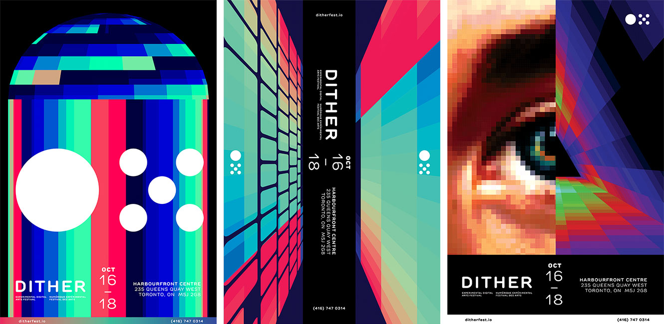
Abstract Poster Development
Representational Poster Development
Symbolic Poster Development
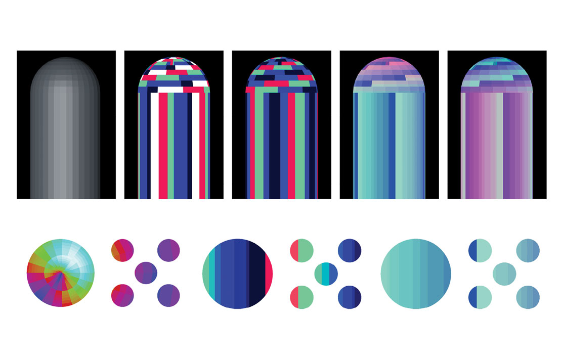
For my abstract poster, I took inspiration from RGB lighting and damaged monitors. Using Cinema 4D, I modelled a cylinder and added a gradient material to make it look like it was glitching. I also experimented with masking it with the emblem.
For my representational artwork, the first concept was modelling a laptop and RGB lighting to represent the making of digital content creation. My other concept was using the Toronto skyline to represent the location of the festival, and RGB lighting to represent the digital nature of the festival.
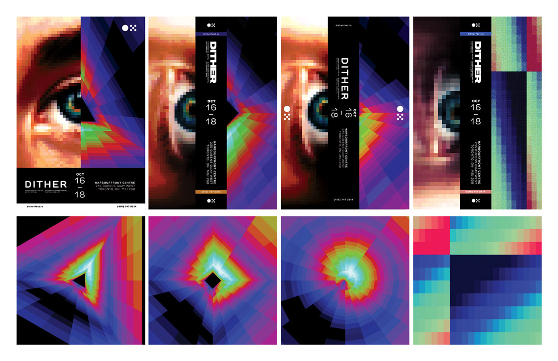
For my symbolic poster, I took both a pixelated photograph of an eye, and a 3D-rendered prism together to symbolize the experience of consuming digital artwork.
Further Development
of Visual Identity
After proposing my visual concepts with the draft posters, I was then tasked with developing the identity further with creating a number of an event tickets. As my event was based in technology, I thought it would be appropriate to design for smartphones.
Ticket Design Exploration
Festival Program Development
and Final Changes
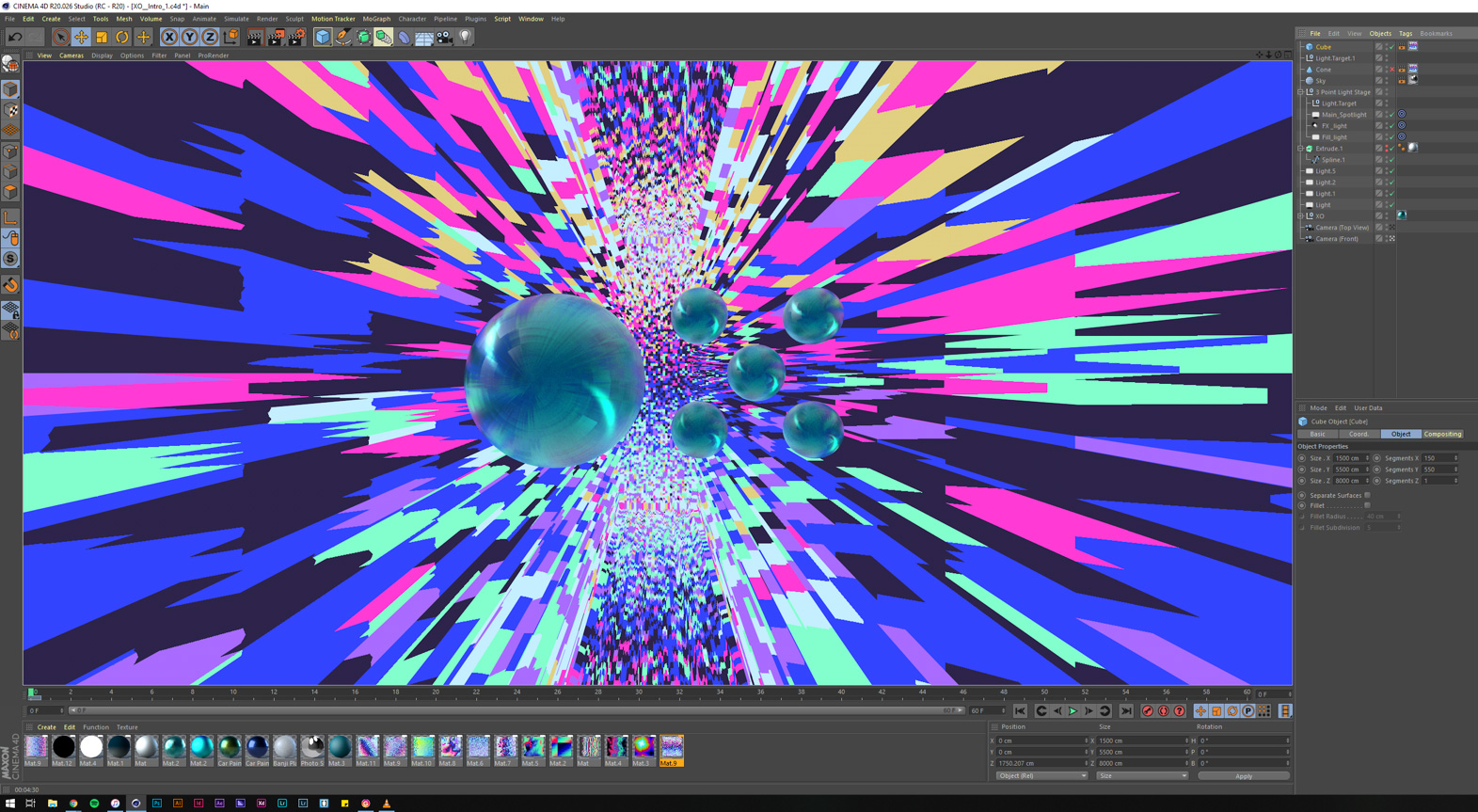
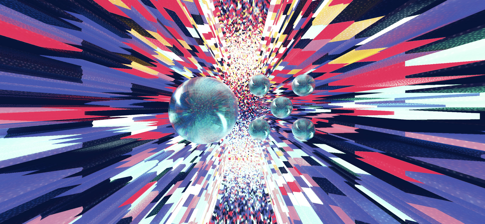
Background Animations
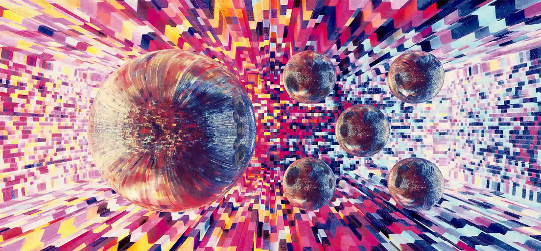
Created animated backgrounds for the digital signage. Visual style in-line with the identity built from other deliverables. Made two graphics that symbolically represent the form (Surface) and function (Internal) of digital technology.
Surface
Continuing with one of the ticket design concepts, I aimed to visually respresent the archetype of modern technology. Visualizing the key words aesthetics, gloss, modern, and interactive — my goal was to represent the "surface-level" of design that often overshadows the required process work and research to reach a final product.
Internal
In contrast to the Surafce design — I wanted to visually represent the inside or "processes" of a digital device. Inspired by broken LCD monitors, I used grain, artifacts, bloom effects, and unpredictablly moving blocks to create an active — but artifical — environment.
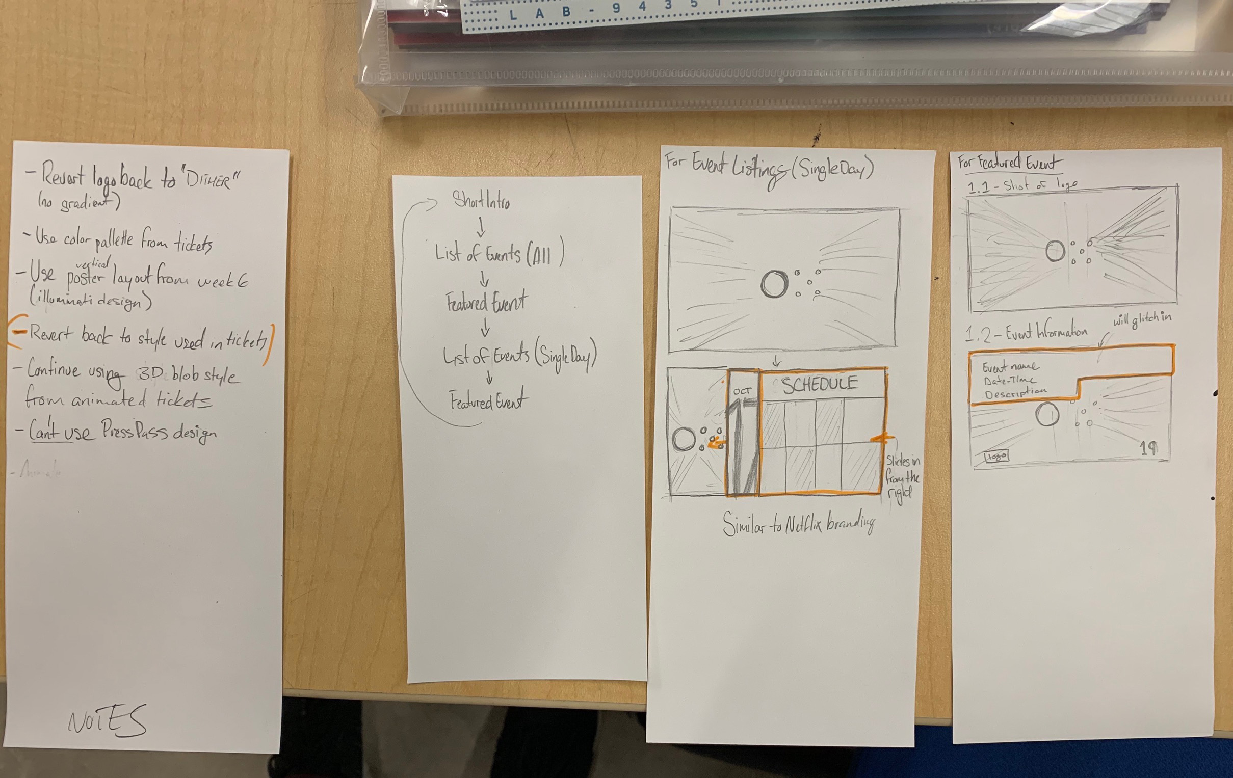
Initial Concepts for the Festival Program Display
Early exploration stages of the festival program display. From written notes, to concepts made in Photoshop and final renders in Cinema 4D and After Effects, my goal for the display was to maintain the visual identity created for the other two deliverables while keeping it easily readable for viewers.
Re-alignment of Visual Identity:
Poster & Ticket Updates
Made visual changes to the promotional poster and digital tickets during the development of the digital displays. Leveraging the themes of RGB (red, green, blue) lighting, and utilizing the Surface and Internal background animations from before, I've implemented them into the other two deliverables.
Check out my other work!
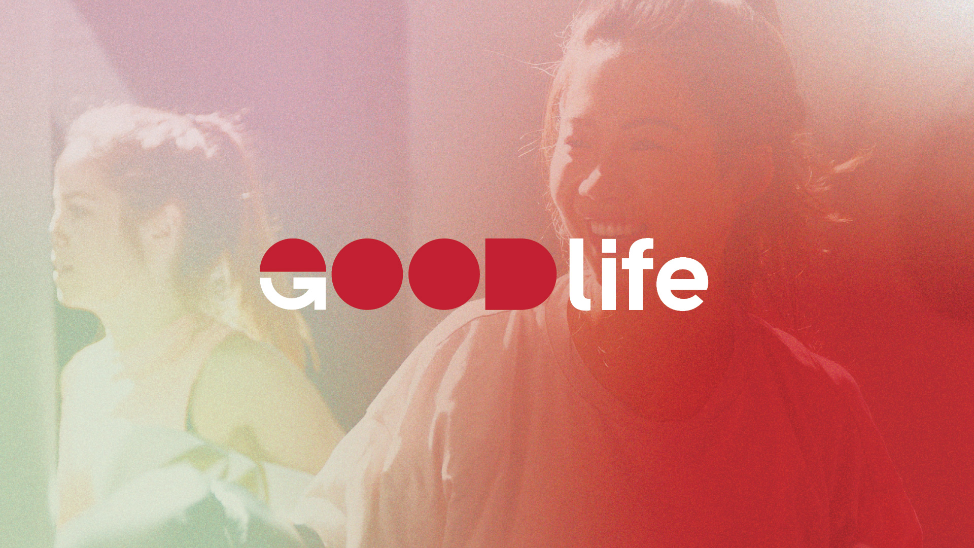
GoodLife RebrandingBranding
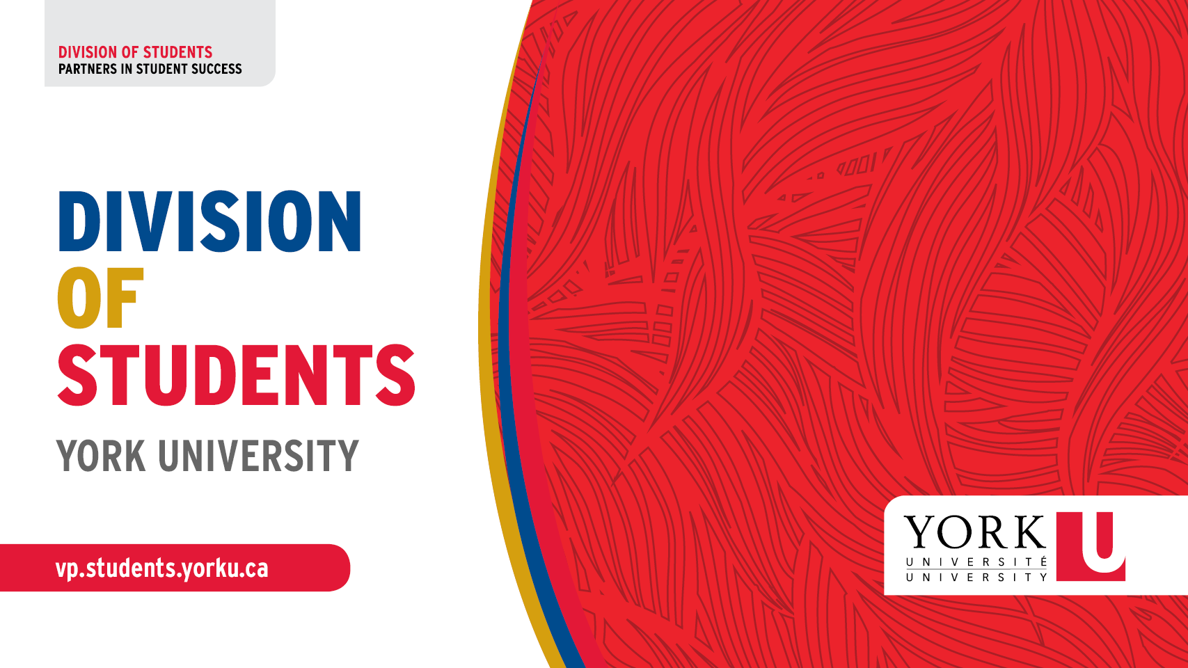
Division of Students — York UniversityBranding, Communication
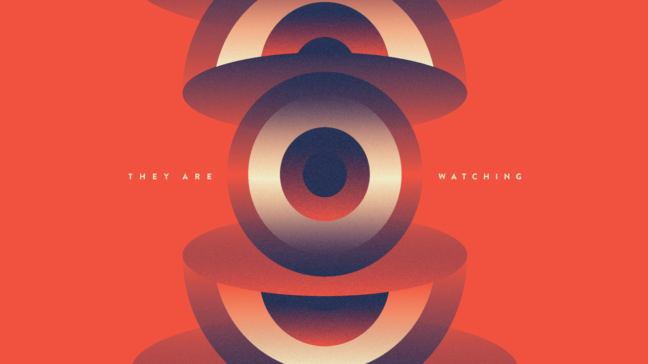
They Are Watching: Internet PrivacyInformation Design & UX/UI
York Lions & Athletics and RecreationBranding, Communication
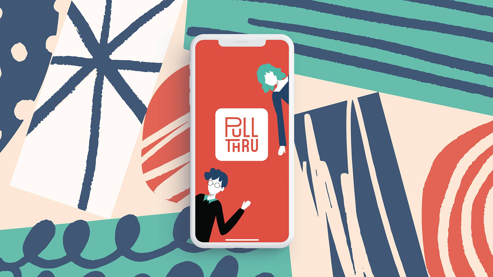
PullThru — Collaborative Event Scheduling AppUX/UI & Branding

Save The InternetBranding & Communications
Logos: Volume OneBranding
Expense vs. EgoCommunications
2048 AnimatedMotion

Semiotic PostcardsCommunications
© 2024 Jordan Campbell | Always learning. Always growing.